

R&D LAB Method In use Built for our own business development
Event Scout
An agentic pipeline for in-person events in the region
A language model reads the event pages; everything else is fixed code. What remains is a short list of where a day in person is worth it.
- 5weighted components in the priority score
- 3distance tiers around the home base
- 3scan bands, driven by each source's yield
- 0database servers: the record is one JSON file
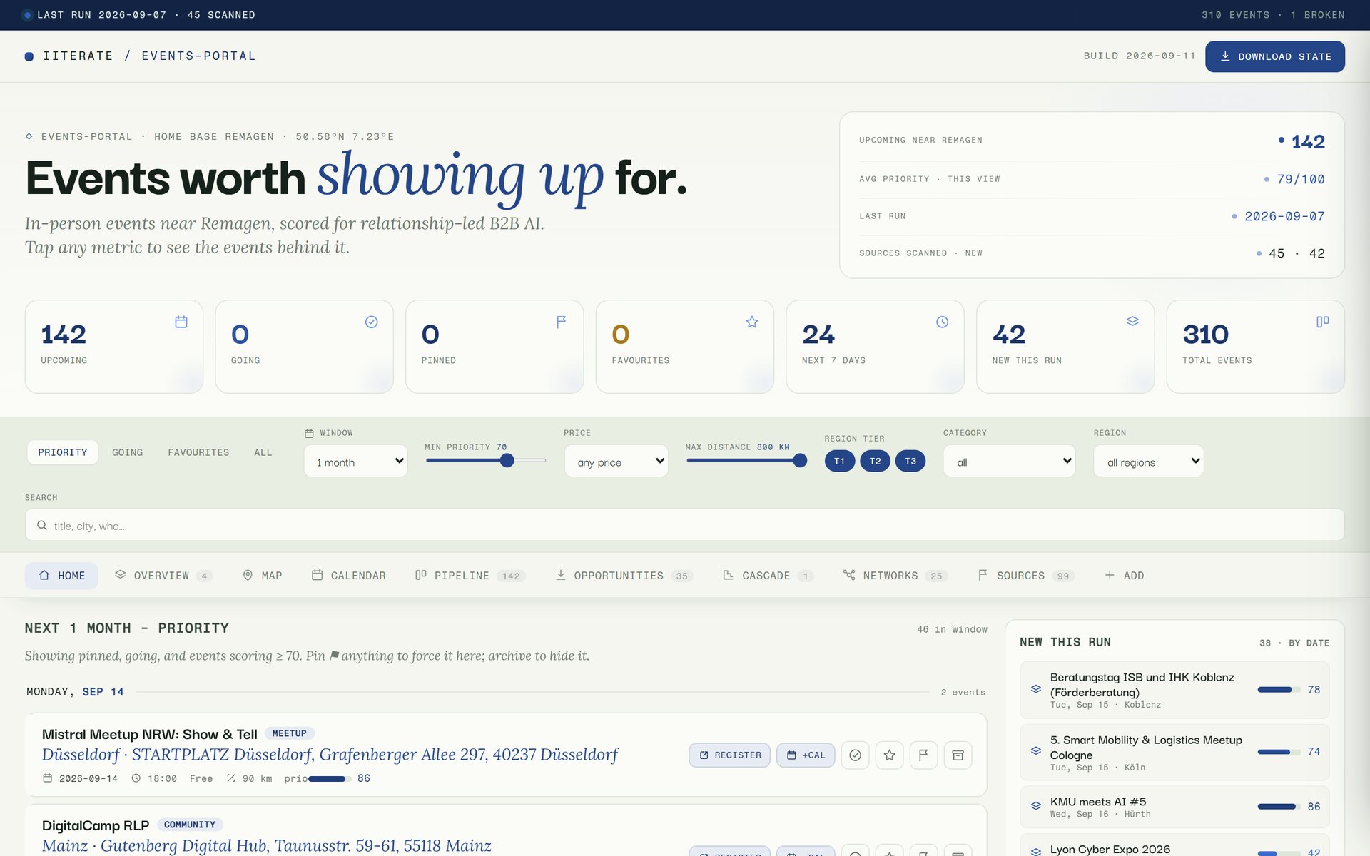
Home view from a sanitised copy of the record. Going and favourites read zero because those flags were removed before the capture.
Why this is published
We sell AI and software. Event Scout is the evidence for the question that comes first in any agentic project: how to put a language model into a process you can rely on every week. The answer here is a division of labour. Fetching, scheduling, deduplication, pruning and the scoring formula are fixed code, the model takes the one step that requires reading, and a file with a fixed schema is the contract between the two. Anyone who wants to automate a recurring screening task in their own organisation can see here where we draw that line.
The events where you actually meet clients are not listed in one place. They are spread across the calendars of chambers and networks, newsletters, meetup groups and university pages, each with its own format, many only readable once a script has loaded the list. Going through that by hand every week is exactly the kind of task that gets dropped. Event Scout is the pipeline that does it for us: it keeps a curated database of such sources, fetches the ones that are due in a batch run, has a language model pull out only future in-person events within reach of the company's home base, scores them for relationship-led B2B sales, merges them into a single record and rebuilds a self-contained dashboard from it.
The decision
The model reads, the code keeps the record
An event page is a poor data format. The same detail appears once as a table, once in the running text of a newsletter, once in a calendar that only loads after scrolling. A regular expression fails on that; a language model does not. That is exactly where, and only where, the model sits: it reads the fetched pages, decides what counts as a future in-person event within reach, and fills in the fields of a fixed schema for each one.
Everything before and after is ordinary code. Which sources are due today, how they are fetched, when two entries are the same event, what drops out of the record after a year and what the dashboard looks like are written in code, not in an instruction to the model. Nor does the model write to the record itself. It delivers a file, and a script merges that file into events.json by fixed rules.
That file is the contract. It has a defined schema, it is the single source of truth, and every view is generated from it. There is no database, no server and no subscription. The most important practical benefit follows from that: when something looks wrong, you can open the file and see whether the fault lies in the reading or in the rules.
Rules being code does not make them correct. The first version of the deduplication treated two entries as the same event as soon as they carried the same link. Many organisers, however, list every date of a series under a single overview page, and so in one run 23 new dates vanished into their older predecessors. It was noticed because the fault left a trace that could be checked: past events marked as found again today. Since then a matching link only counts as a hit when the start dates are no more than three days apart.
A language model is good at reading a messy page. Keeping a record is not that kind of task.
One run
From the source list to the dashboard
- 01 Plan A script reads the source database and decides from past yields which sources are due in this run. The plan can be printed beforehand, with the reason for every source that is skipped.
- 02 Fetch Each due source is rendered in a headless browser and scrolled to the end so that lazily loaded lists are complete. The readable text is stored and, where the page offers it, structured schema.org Event data, plus a log entry per source.
- 03 Read The language model reads the stored pages, structured data first. It keeps only future in-person events within reach, and online-only dates only when both topic and audience clearly fit. For each one it fills in date, venue, price, links, a short summary and the reason it is relevant.
- 04 Score Each event receives a priority score from 0 to 100 made of five weighted components. The weights are fixed; which level an audience or a format reaches is estimated by the model while reading.
- 05 Merge A script merges the new entries. The same link with start dates at most three days apart, or the same normalised title with the same start date, counts as a duplicate: the stored entry stays and empty fields are filled in. A new date in a series is a new entry.
- 06 Prune and build Anything more than a year in the past and not marked as a favourite moves to a log. The number of kept events per source is fed back to the scheduler, then the dashboard and a readable text version of the record are regenerated.
Who decides what
Fixed code
- Which sources are due in a run, and in what order.
- Fetching, scrolling and storing text and structured data.
- The weights of the scoring formula and the cap for expensive formats without a lever.
- Distances to known cities, from a bundled table.
- Deduplication, pruning after a year and merging human decisions.
- Building the dashboard from the record file.
Language model
- Whether an entry is an event at all, and whether it is future and in person.
- Date, venue, price and links out of inconsistent text.
- The level for audience, relationship potential and access lever that goes into the formula.
- A summary and the sentence on why the event is relevant.
- An estimated distance when a city is not yet in the table. It is added to the table afterwards.
What the priority score is made of
The priority sits on every event
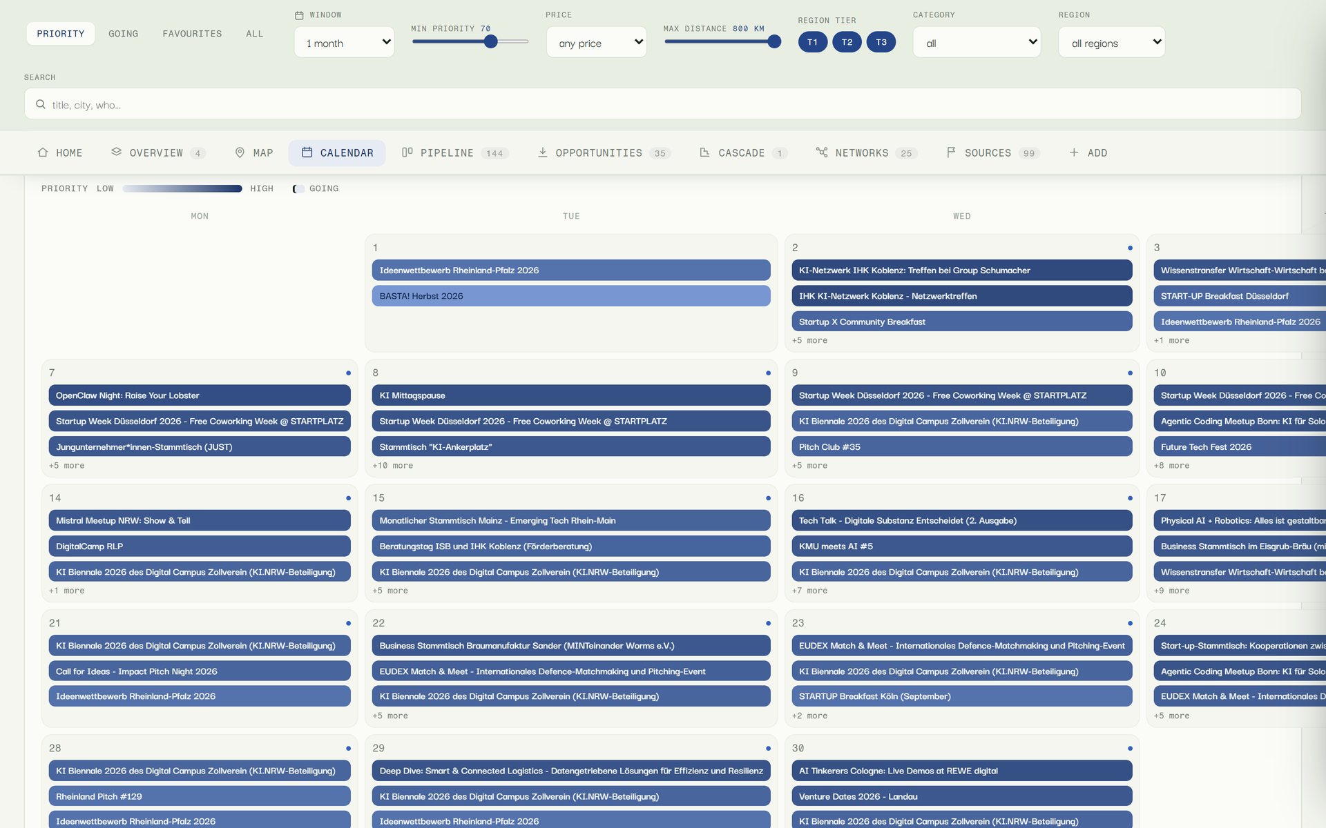
The score does not stay a number in a file. On the home view and in the pipeline it appears as a bar beside every event, growing in length and depth of colour with the score. In the calendar a day's entries are tinted by priority, and the filters above the tabs, a minimum-priority slider among them, apply to every view at once.
Anyone who wants to know why an event is near the top opens its detail view. There the score is broken down: location and timeliness exactly, because they follow directly from the formula, the rest as a combined share for audience, relationship and lever. Alongside are a reference to the source it was found through and a prefilled calendar entry.
Distance as a tier
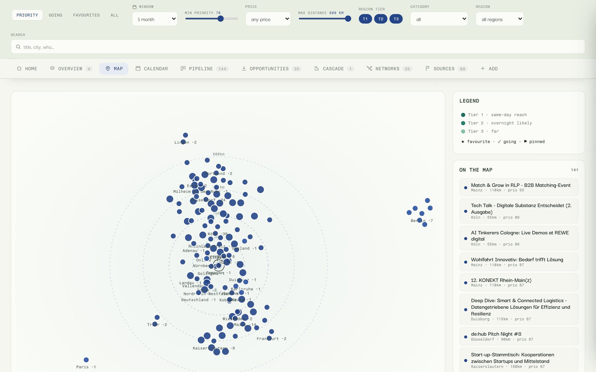
The rings mark 50, 150, 300 and 600 kilometres, drawn at fixed spacings and not to scale. Every known city has a fixed position, the dots of one city fan out around it, and high-scoring events get a larger dot. The list on the right orders the same selection by priority.
What counts for the score is not the number of kilometres but the tier. Tier 1 covers Rhineland-Palatinate, North Rhine-Westphalia and Hesse with their surroundings, destinations reachable there and back in a day. Tier 2 reaches across the rest of Germany to Luxembourg, Switzerland and France; tier 3 is the rest of Europe and only included for exceptional occasions. Driving times come from a bundled table of cities.
Schedule
Sources earn how often they are asked
A source queried equally thoroughly every week costs time even when it has produced nothing useful for months. So every source keeps a short yield history: how many events the model kept from it over the last five runs. The average places it in one of three bands. The model's judgement therefore steers the schedule only through a counted number.
Band A is queried on every run. It holds sources averaging at least three kept events and sources rated as especially important, even after an empty run. Band B holds sources with some yield or no history yet; they are due again after seven days, at most eight per run, oldest first. Band C collects sources that repeatedly deliver nothing. They pause for seven, then fourteen, then twenty-eight days, thirty at most, and are then tried again, at most three per run.
A page that loads but shows no events only moves down the order. A source counts as broken only after it could not be fetched three times in a row. New sources come, among other places, from a register of public networks, accelerators, research institutes and clusters in the region: if an organisation there has an events page that is not yet in the source database, it can be added. The register itself is never read as an event source, so that nothing is counted twice.
Human decisions flow back into the same record
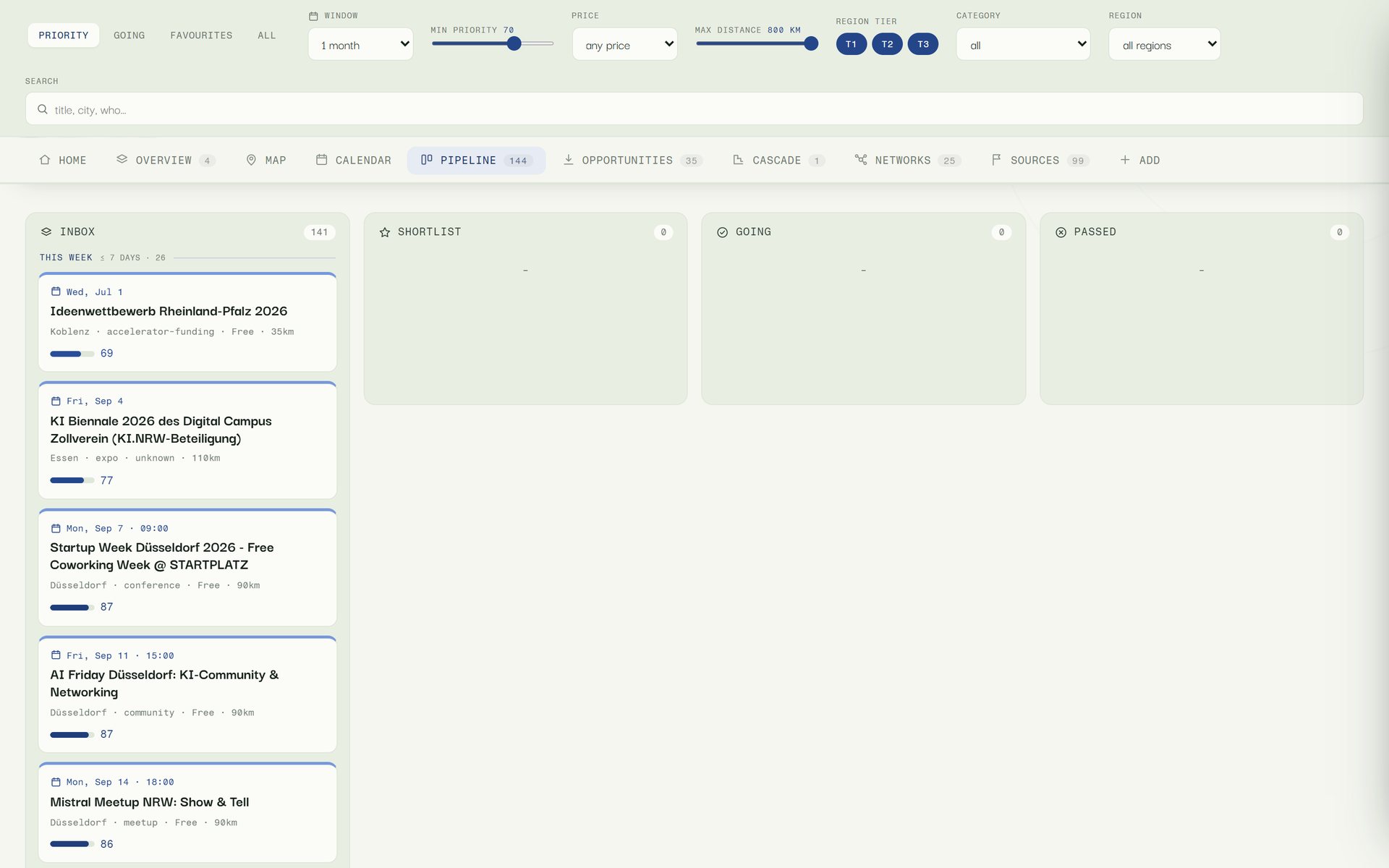
What someone intends to do about an event is not decided by a model. In the pipeline view a card is dragged from the inbox to the shortlist, to going or to passed; in the lists, events can also be marked as favourites, pinned or archived.
The dashboard is a single HTML file with no server, so these decisions first live in the browser. A button exports them as a state file, and the next run merges them into events.json before anything is fetched: attendance, favourite, archive, pin, manually added events and suggested new sources.
Favourites are exempt from pruning and stay in the record even after years. A pinned date appears on the home view regardless of its score, and none of these flags changes the priority score itself.
One dataset, three readings
The same events as list, map and calendar
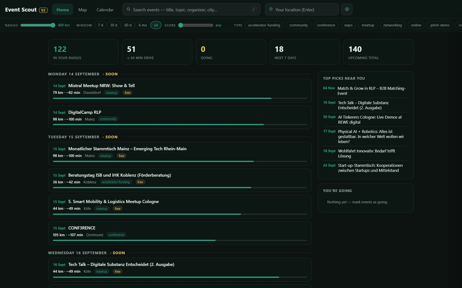
ListAll three views show the same filtered dataset. The radius, time window and minimum relevance at the top apply to list, map and calendar alike.
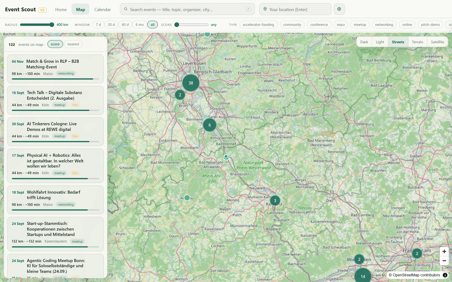
MapThe clusters show at a glance where events concentrate: Cologne and Bonn carry the largest counts, the Ahr valley and Koblenz the smaller ones.
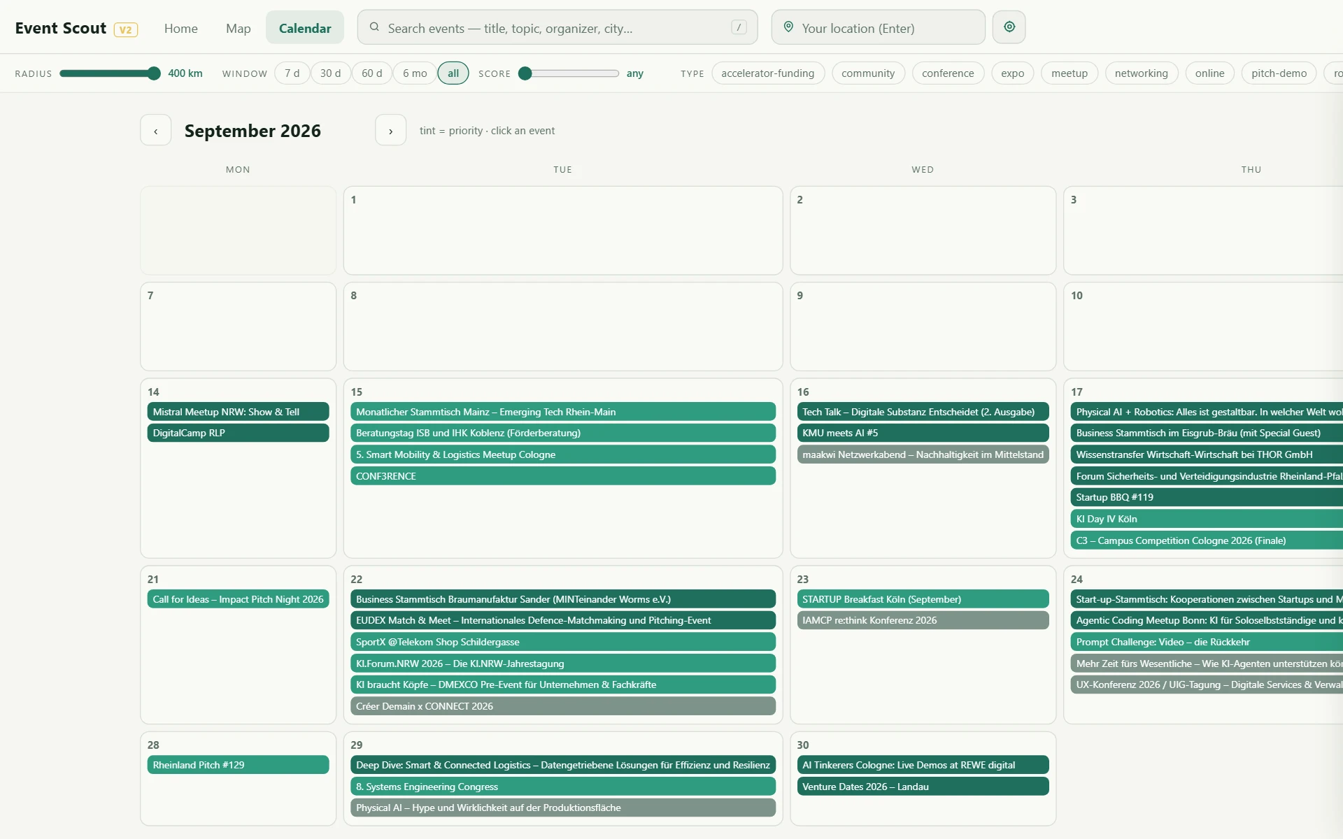
CalendarThe calendar is set light, the list and map dark: the same interface fitted to each task, with the data unchanged.
Where the same construction fits
- Screening public tenders from several procurement portals and ranking them by your own criteria.
- Tracking changes to standards, guidelines or vendor documentation across many publisher sites.
- Market and competitor monitoring from press releases, product pages and trade calendars.
- Merging exhibitor and supplier lists from different trade fairs into one shared, deduplicated record.
- Any recurring screening task where someone today opens the same pages by hand every week.
Image credits: every image is a screenshot of our own application, made from a sanitised copy of the record. The events visible are publicly announced dates of their respective organisers.
Why this is published
What this means for your project
More from the lab
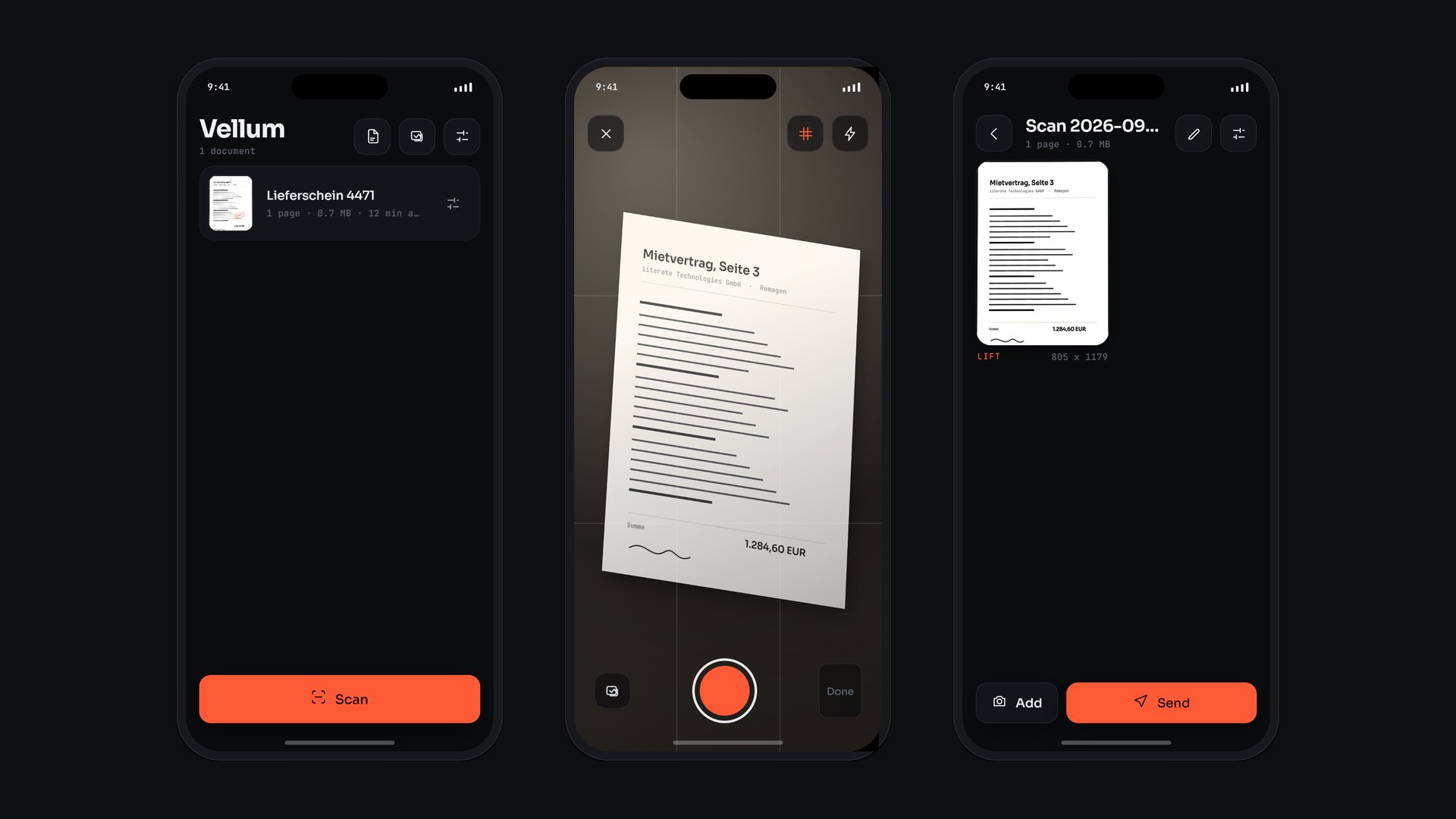 Applied Research Vellum Edges, perspective, light and text are all worked out on the phone. A document leaves the device only when someone sends it.
  Computational Design Atlas EV1 Twelve chapters take an electric car apart, down to a single cell. No model files, no textures: 327 parts generated from one dimension table.
 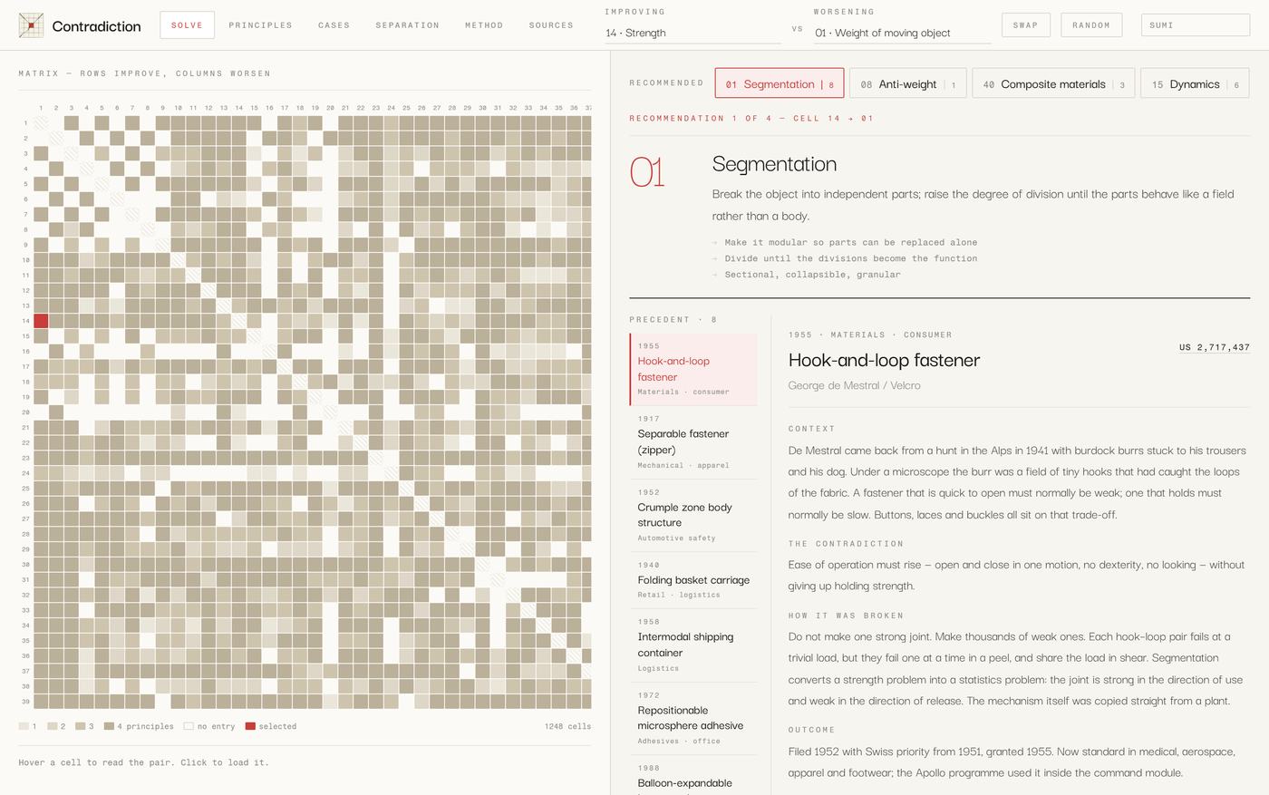 Method Contradiction State what has to improve and what gets worse when it does. You get the principles that resolved that exact pair, and the inventions that did it.
 Does someone in your organisation open the same pages every week to keep a list up to date? That is exactly what a pilot is for.
Get in touch