PROJECT3D Design
A Concept Film for an Invisible Security Product
62 seconds of isometric 3D that turn security validation into a place: every tool a shield, every gap a missing piece, every attack a red line.
62s
film, title card to end card
4
cuts before sign-off
0
footage, all of it built rather than filmed
A product you cannot see
FourCore does not sell software you can demonstrate by opening it. The product checks whether the security tools a company has already bought actually fire when it matters: it replays attacks under control and measures what gets noticed and what gets through.
That is hard to show, because every part of it is invisible. The tools are invisible, their misconfiguration is invisible, the attack is invisible, and the proof that it would have been caught is invisible too. Explain it with screen recordings and you are showing tables; explain it in words and you need three minutes and a vocabulary.
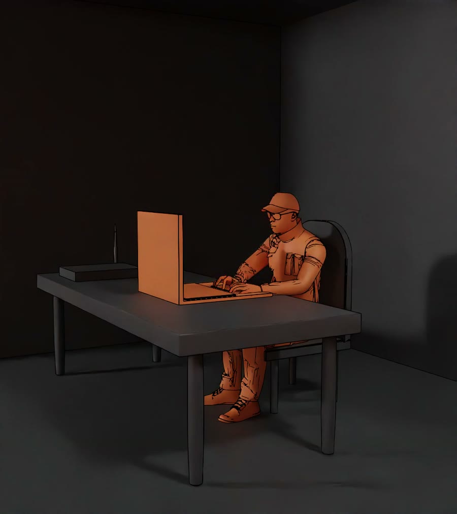
What was needed was something that works before the first piece of jargon: a film to run at a product demonstration that makes the point inside a minute. The brief came with a fixed date, which was the real constraint.
Built for FourCore.
A condition becomes a place
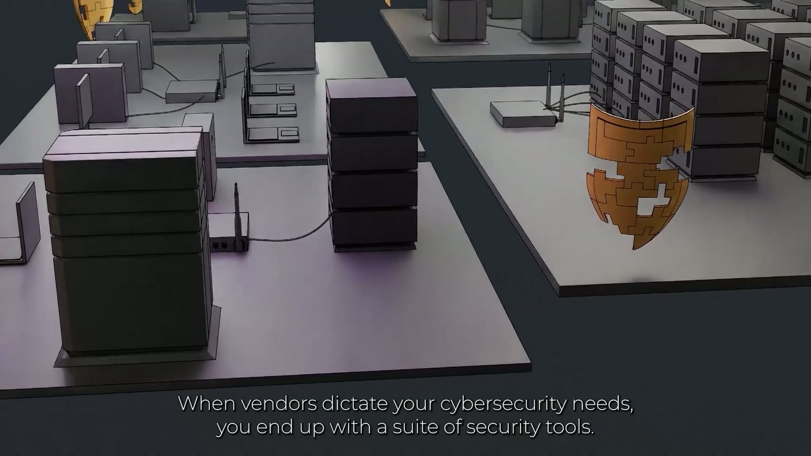
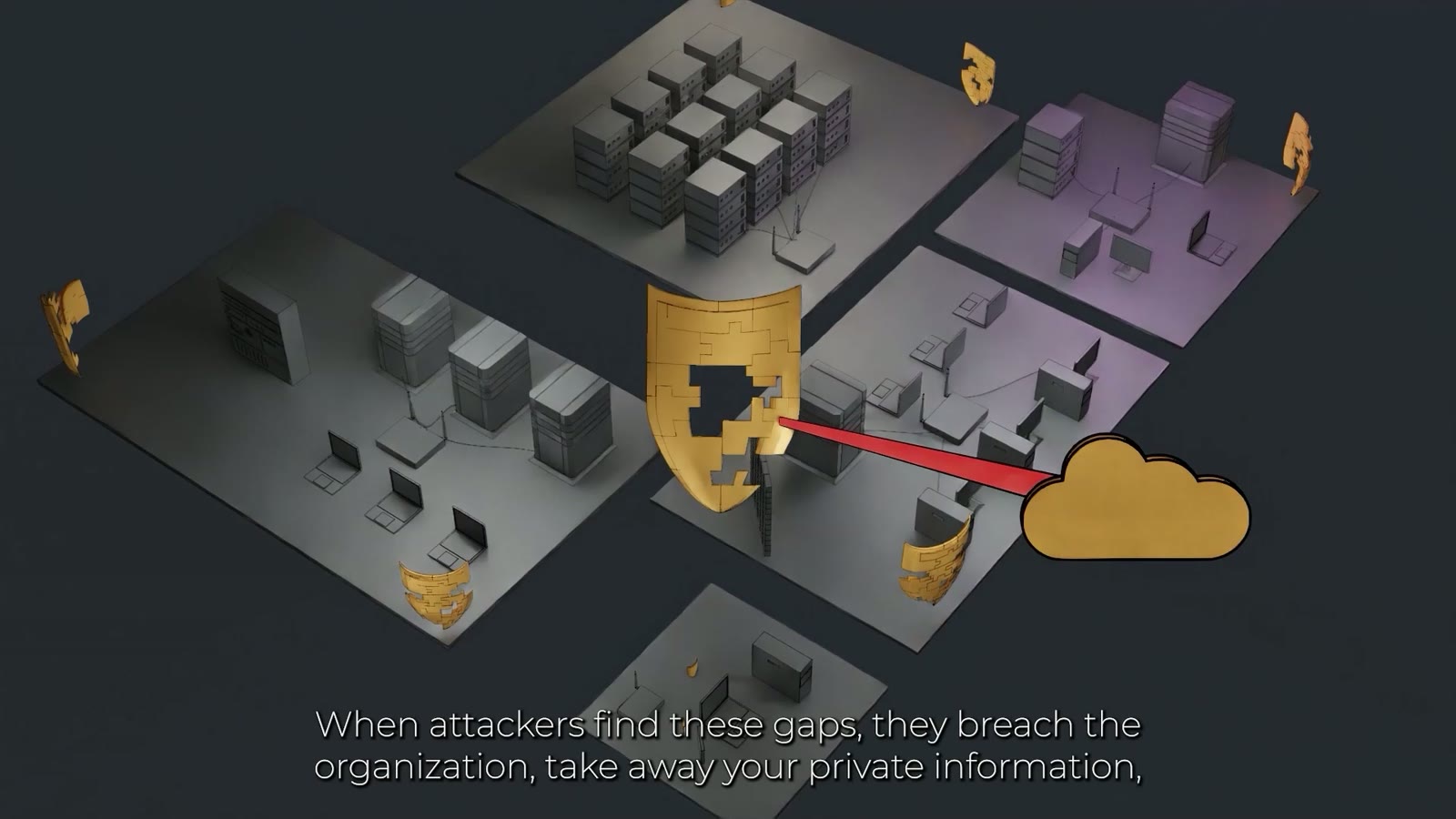
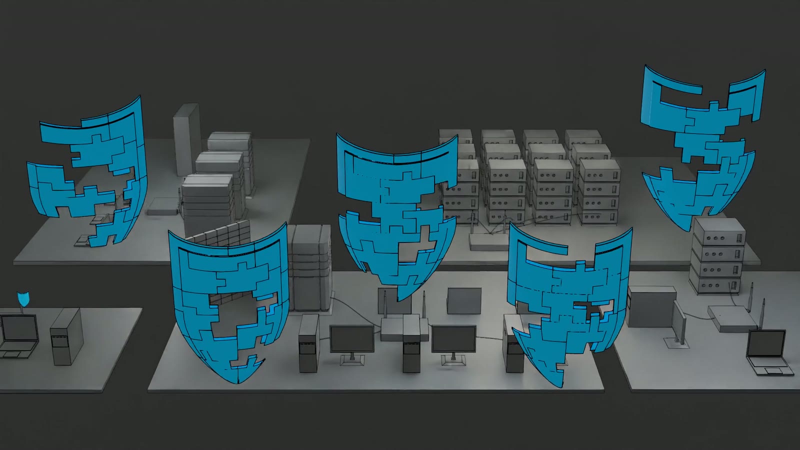
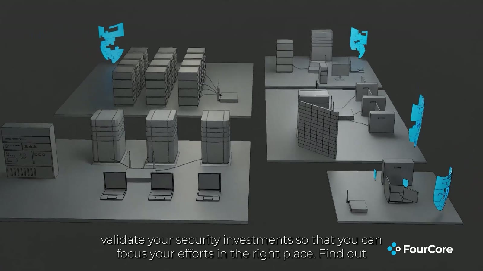
The decision everything else hangs on: security is not shown as a diagram but as a place. The film plays out on floating isometric plates carrying a company you recognise. Server racks, desks, monitors, network cable, a cloud off to one side for everything that has been outsourced.
Isometric, because that projection does two things at once that a camera perspective cannot: it shows the whole estate at once, and it draws every part of it at the same size. Nothing sits closer to the front because it matters more. For a product whose argument is your estate has gaps and you do not know where, that is not styling, it is the argument.
A shield stands on each plate. The shield is the one image for protection that needs no explaining, and that is exactly what makes it useful here: it costs nothing to read, and the whole rest of the story consists of damaging that familiar image.
What is missing takes a shape
The shields are not whole. Pieces are missing from them, the way pieces are taken out of a jigsaw, and the loose pieces drift in the air beside them. You see a gap before anyone has said the word gap.
This is the core of the piece, and it is where the metaphor stops being decoration. A misconfiguration is precisely that: not a missing tool, but a tool you own with a hole in it. The film spends no words on it, because the picture already carries the statement.
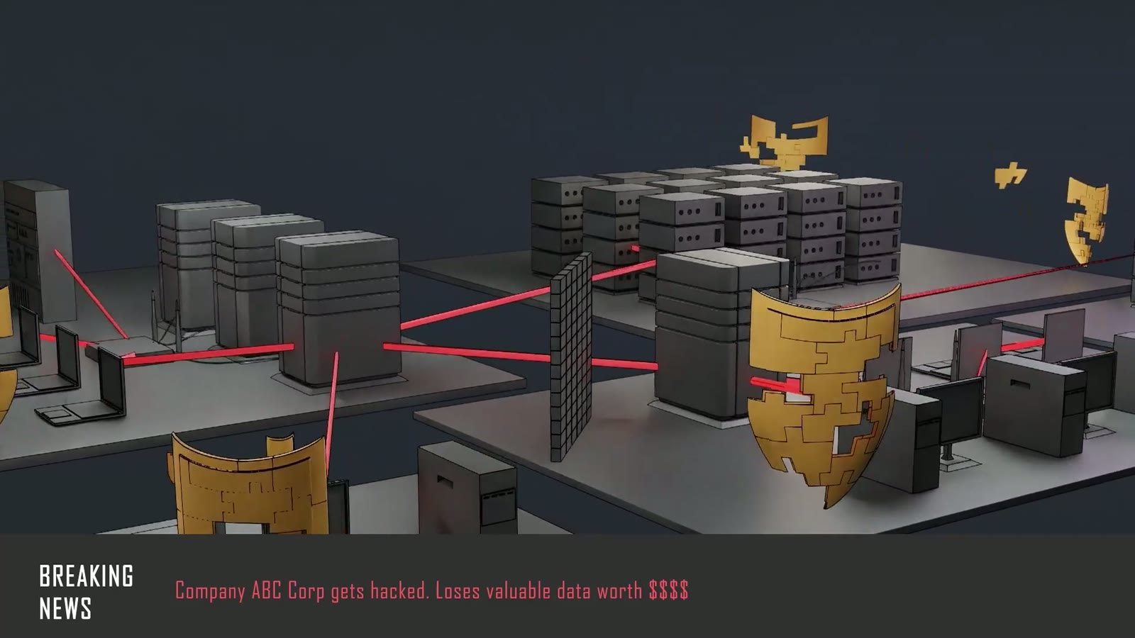
Attacks are red lines. They come from outside, find the holes and go through them rather than past them. They do not hit the shield, they hit the place where it is absent. Then they carry on to the cloud, and what arrives there is the data loss the line of text beside it names.
The shield geometry comes from a scene of its own and is reused across the whole film, in gold, in red and finally in blue. A viewer has to recognise the same form three times, or the ending does not land.
Colour carries the argument
The film has three colour states and they are the real structure: gold for the estate as it stands, damaged and unaware. Red for the moment something happens. Blue for the same place once it has been tested. Turn the sound off and the order still reads.
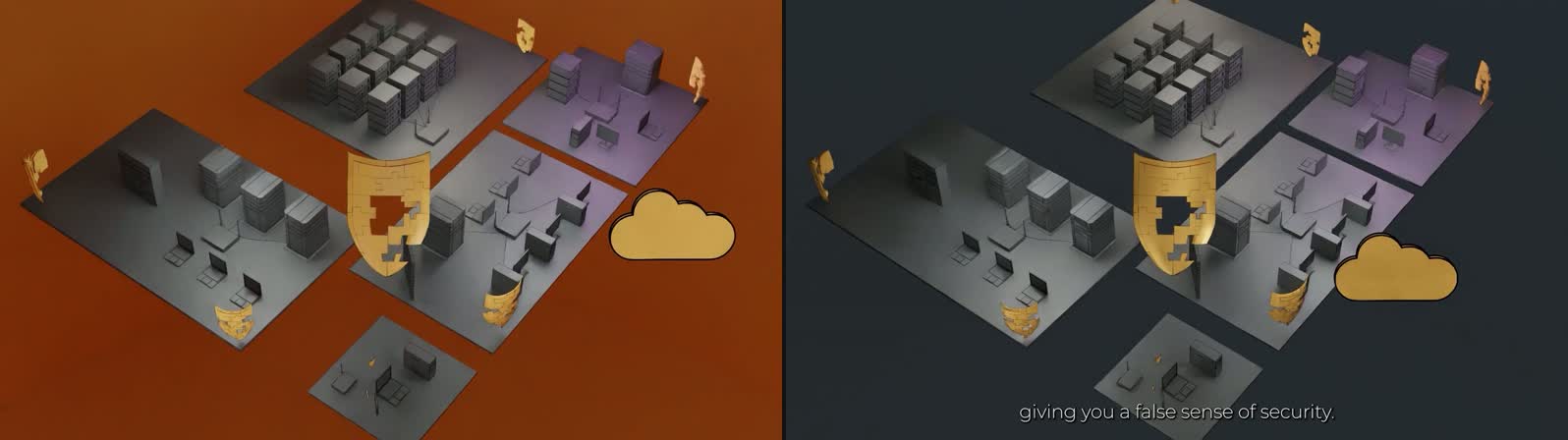
The first cut sat on a burnt orange. Measured, the background there is about RGB 135, 65, 13; from the second cut on it is RGB 35, 42, 47, a dark slate. The reason is not taste. Orange sits too close to the gold of the shields and too close to the red of the attacks, and a background competing with both signal colours takes the force out of exactly the two elements carrying the point. On the dark ground the same shot reads immediately: gold in front, red as an event, everything else held back.
The pair of images beside this shows the same shot in both cuts: same camera, same shield, same cloud.
The moment it turns
Halfway through, the film briefly leaves its own world. A news bar slides in, dressed as a breaking story, and reports the incident the way an outsider would read it. It is the only moment that does not come from the world of the plates, and it sits there because this is where the damage stops being technical.
After that the whole place tips into red. Not one alarm in one spot, but every plate, every machine, the floor. The line beside it says a hundred alerts are open and nobody knows which one counts, and that is exactly what the image is meant to produce: not danger, but overload. A single red warning symbol would have shown the opposite, a clearly named problem.
At the peak it cuts to black. The brand stands alone for a moment, and only then does the place come back. That cut is where the problem turns into an offer, and it works only because something actually hurt beforehand.
Scores that are not all a hundred
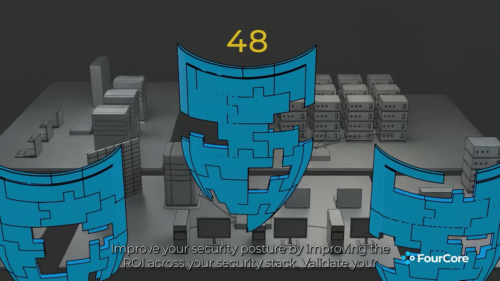
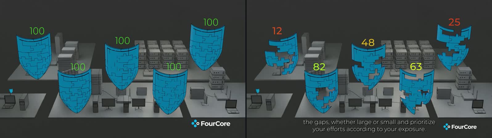
The ending shows the same place in blue with a number above each shield. Not the same number everywhere: 12, 82, 48, 63, 25, graded from red through yellow to green. That is the product benefit in one image, because it carries the statement you now know where you are weak without a single technical term.
In the first cut every shield read 100, all of them green. That is the mistake that would have cost the most, and it is visible in the picture itself: the shields were still full of holes. A score of a hundred on a shield you can see through is not optimistic, it is not credible, and it also says the wrong thing about the product, because a testing tool that awards top marks everywhere has no reason to exist.
The correction was not to change the numbers but to bring number and geometry into agreement: the shield with the low score is visibly more broken than the one with the high score. Only then does the image stop claiming something you can see through.
The third cut also re-staged that ending. It had run as a close-up across a single shield, so only one value was ever on screen; afterwards the camera stands back far enough for five shields and five values to be visible at once. The film grew by about two and a half seconds, and that is the reason: the benefit is the comparison between the values, not any single value.
What was actually handed over
Four cuts before sign-off, from the first in mid March to the final in mid May. Subtitles were burned into the picture only at the very end, once the edit and the length were settled: baked-in type is the most expensive change in the chain, because every correction to it means a fresh export of the entire film.
What was handed over was not only the finished file but the workshop behind it: the complete 3D scene with geometry, cameras and materials, the compositing projects, the edit project, the set of vector graphics for the symbols, the separately rendered building blocks such as the shield animation and the attack sequence, and the audio.
That is the part that separates a concept film from a video file. A team that changes its positioning, swaps a number or needs another language can carry on where we stopped instead of commissioning again. That is why the blocks are filed individually rather than existing only inside the final assembly.
The moving images on this page are silent excerpts. The soundtrack of the original carries licensed music and is not reproduced here.
Frequently asked questions
The concept film for a security validation product shows security not as a diagram but as a place: a company on floating isometric plates. Every tool is a shield, every misconfiguration a missing piece, every attack a red line. The film runs 62 seconds and was made for a product demonstration.
The 62-second concept film for the security product was made with Blender, After Effects and Premiere Pro. There is no filmed footage, everything was built. The shield geometry comes from a scene of its own and is reused throughout the film in gold, red and finally blue.
The concept film for the security product went through four cuts before sign-off, from the first in mid March to the final cut in mid May. Subtitles were burned in only at the very end, once edit and length were settled, because every correction to them requires a fresh export of the entire film.
Along with the finished concept film, the workshop behind it was handed over: the complete 3D scene with geometry, cameras and materials, the compositing and edit projects, the vector graphics for the symbols, separately rendered building blocks such as the shield animation and attack sequence, and the audio. Numbers, positioning or language can therefore be changed later.


Get to know more
HAVE A COMPLEX IDEA THAT YOU WOULD LIKE US TO IMPLEMENT?
KICK OFF WITH A DESIGN-THINKING PILOT OR A CONSULTING CALL.