

PROJECTSoftware & Automation
Nomad X Collective
Multi-vendor marketplace for curated fashion: admin, vendor panel and storefront on one shared data foundation.
3
Systems on one data foundation
6
States in the order cycle
5
Areas in the vendor panel
Software for one merchant, a business with many brands
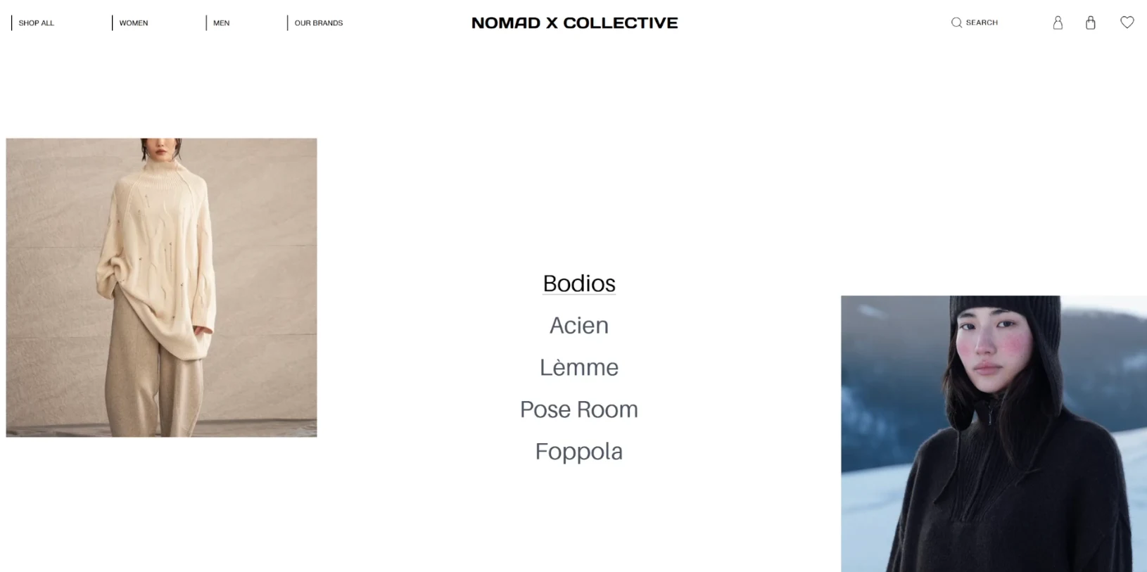
As late as mid-2025, nomadxcollective.com ran on standard shop software. It is built for one merchant: one warehouse, one shipping account, one person who maintains prices. The business behind it had long been a different one. Nomad X Collective curates independent brands that sell their origin along with the garment, each with its own warehouse, its own shipping account and its own idea of what has to be said about a piece of clothing. Force those brands into a system that knows only one merchant, and someone ends up retyping everything, and every change turns into an email.
The brief was therefore: three connected systems that feel like one brand and serve three user groups with very different jobs.
- Platform operations: orders, revenue and new sign-ups at a glance, without anyone building a spreadsheet for it.
- Partner brands: their own catalogue, their own brand page, their own fulfilment steps, without a developer on call.
- Customers: a purchase that feels curated and not like a marketplace template.
On top of that came the timing. The platform was to launch together with a complete rebranding, so the customer-facing interface had to carry a new visual identity while underneath it a marketplace ran for the first time.

One data foundation, three interfaces
We built the platform as three connected systems on top of a shared data foundation and distributed the design effort unevenly. The storefront carries the complete rebranding, the admin and vendor panels run on a leaner, functional base UI. That is a sequence, not a cost saving: the processes underneath have to be right first, because a beautiful vendor panel with a wrong order status is worthless.
1. Shared data, separate ownership
- Products, variants, stock, orders and customer data sit in one data foundation that all three systems address through the same REST interface.
- Ownership of the content stays separate. Credentials for brands are created centrally so that onboarding stays in one place; the brand and product data of a brand belong to it afterwards.
- All images sit in an S3 bucket in eu-central-1. Brand logos and the images of the brand pages are stored separately per merchant, product images sit in a shared namespace, because they belong to the product and not to the brand.
2. The import is the real translation work
Brands often bring an existing shop with them, on Shopify or WordPress for example. The vendor panel has a button for that which connects the external shop. The import saves the retyping, but it does not solve the harder problem on its own. Two shops describe the same garment differently: sizes are named differently, colour names are in-house terms, and what one shop lists as two products is a variant of the same product in the other. On a marketplace with shared filters this has to become one vocabulary, otherwise the colour filter falls apart into synonyms and finds nothing. How far a reconciliation reaches also depends on what the external platform in question exposes through its API. We told the client exactly that instead of promising a full synchronisation.
3. Editorial content as a data record
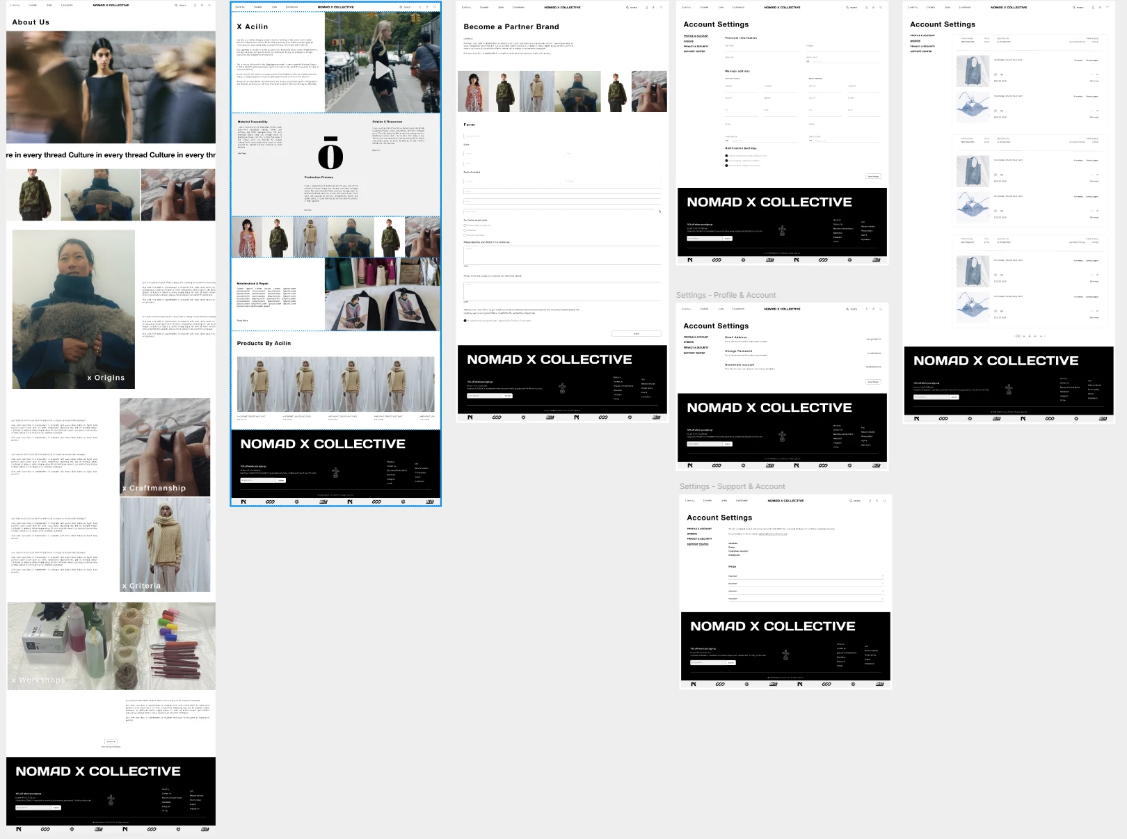
Home page, about, contact, footer, partner programme and workshops are each a configuration that the storefront loads at runtime; brand pages are their own structured data record. Images, texts and the visibility of entire sections can be changed with it without anyone deploying.
Shipping without a shared carrier account
Every partner brand ships from its own location through its own shipping account. So there is no shared stream of shipments that the platform could read out, and no way to query the delivery status server-side.
That concerns more than the status display. When shipping sits with the brand, an order across two brands inevitably becomes shipping twice over: two parcels, two transit times, two tracking links. The basket therefore shows shipping costs per merchant and only adds them up afterwards. For the same reason we modelled return and refund as their own workflow. A refund touches stock, merchant payout and customer communication at the same time, and as a rule it concerns part of the order, not all of it.
The process is accordingly built around the actual shipping relationship:
- The brand sets its part of the order to “shipped” and enters the tracking link that its own account generated.
- Exactly that link goes out automatically as an email.
- “Delivered” is confirmed manually by the brand as soon as it sees it on its side.
An automatic delivery status would be nothing but a guess at this point, and a guessed promise is worse than an honest answer. The storefront therefore says exactly what the system knows, and it says it where the question arises. The shipping section of the product page reads “Each shipment is managed directly by our brand partners; therefore, costs and delivery times vary based on your location.”, and further down in the same section “Once your order has been dispatched, you will receive a tracking link via email.”
The storefront carries the rebranding
The storefront is the surface on which the brand story becomes a purchase. The home page has a fixed structure of video hero, “Latest Arrivals” and “Meet Our Brands”, whose content is set editorially. Fixed structure, free content: layout without sprawl, editing without deployment.
1. Catalogue
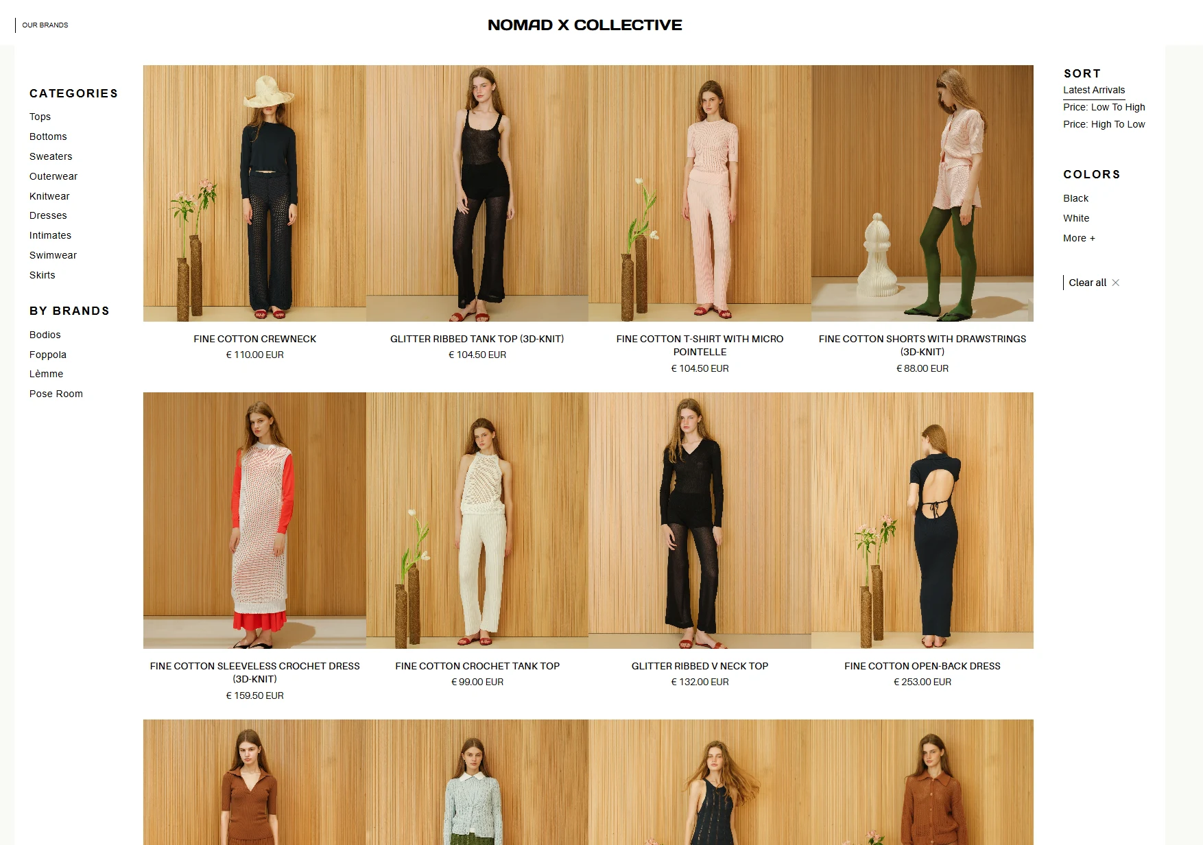
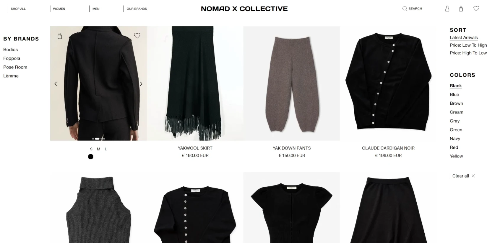
- Filters by category, brand and colour, sorting by newness and price, page-by-page navigation with 16 items per page.
- Sizes and colour variants are already in the tile, as are the wishlist and the basket. Anyone who already knows which size and colour it should be does not have to open the product page at all.
- Basket and wishlist work without an account through a server-side guest ID. Signing in is possible by password, one-time code or Google.
2. Product page
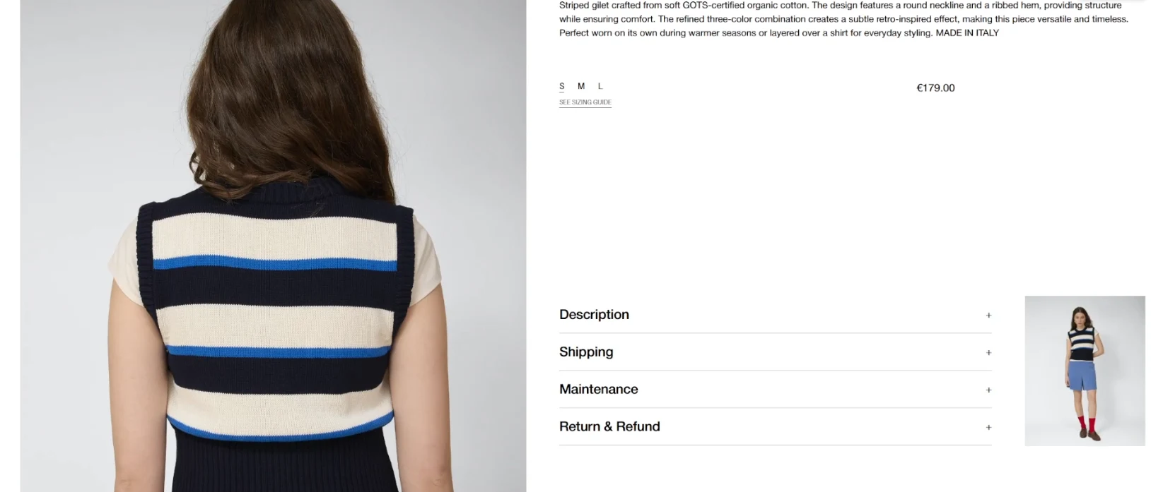
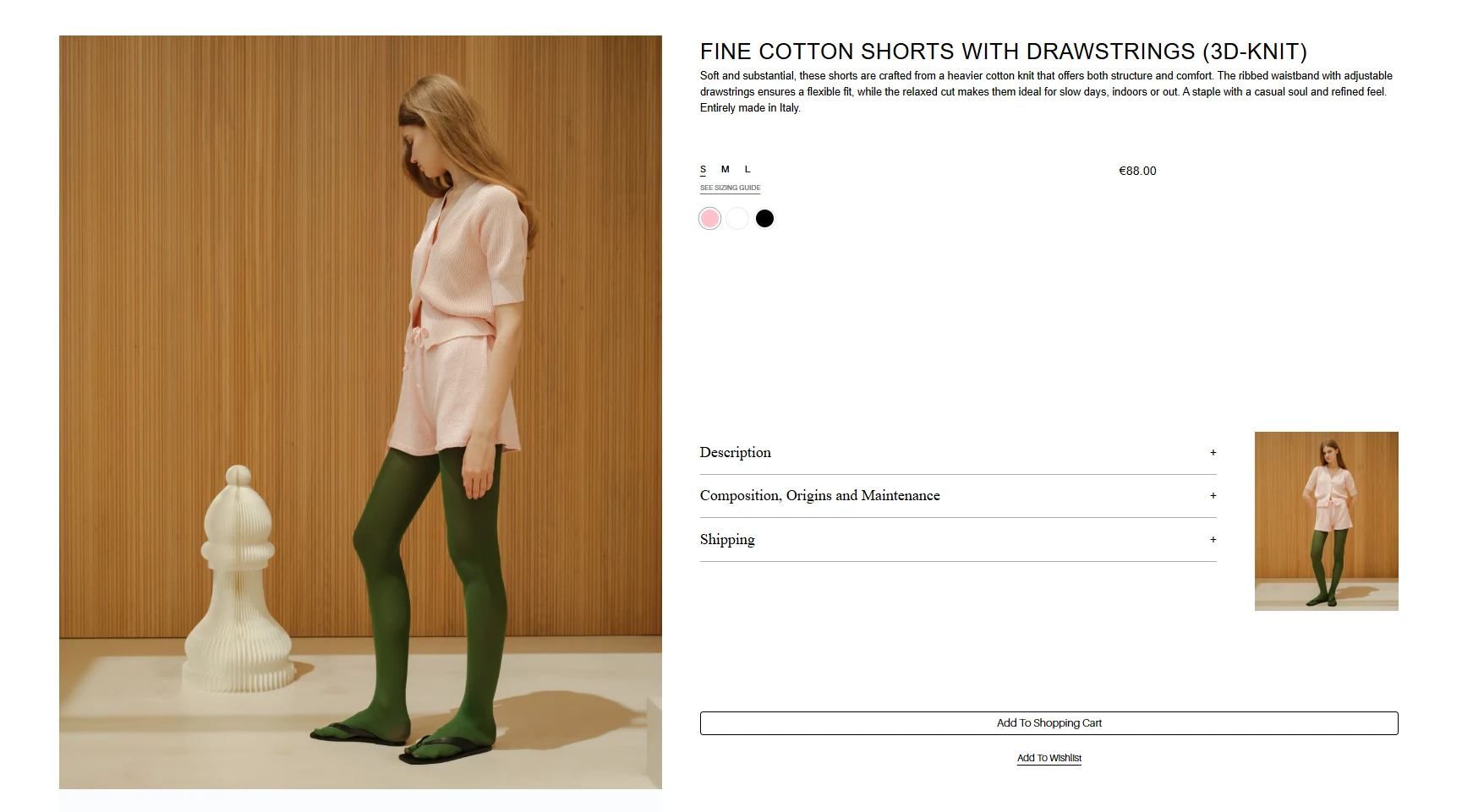
The product page is layered. Below image, size and price sit expandable sections, and which ones those are is decided by the brand through its own content. A Mongolian yak trouser carries its own transparency section with the place of production; an Italian-made knit combines composition, origin and care in one section and names its certification there. Below that stands the brand with its name, its story and a link to its own page.
3. Brand pages
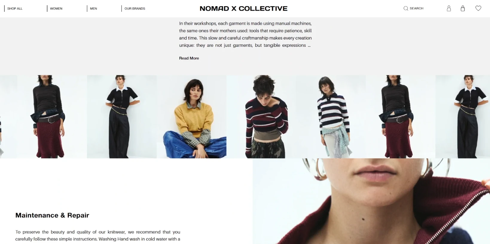
Every partner brand gets its own page with the same structure: brand story, the blocks Material Traceability, Production Process, Origins & Resources and Maintenance & Repair, and its own products at the foot. Origin thus becomes a structure in the system that every brand fills itself. The partner brands fill it with very different content, from a Mongolian manufacturer founded in 1991 to a knitwear collection made in Italy.

Vendor panel: self-management instead of a support ticket
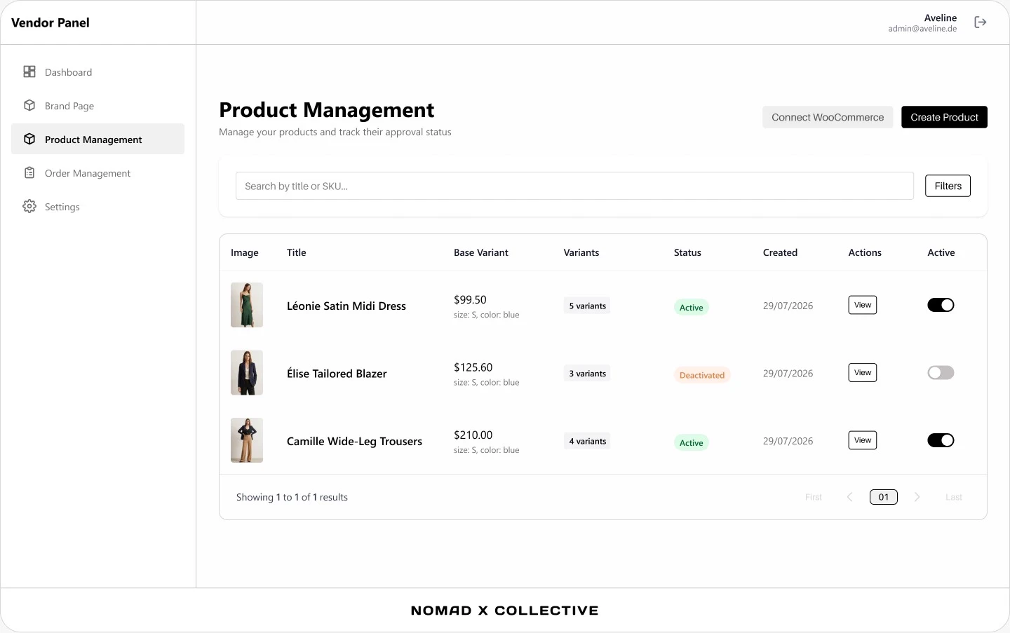
The vendor panel gives every partner brand a workspace of its own with five areas: dashboard, brand page, product management, order management and settings. A brand should be able to change a description or mark an order as shipped without occupying anyone on the platform team.
1. The product is a shell, the variant is the goods
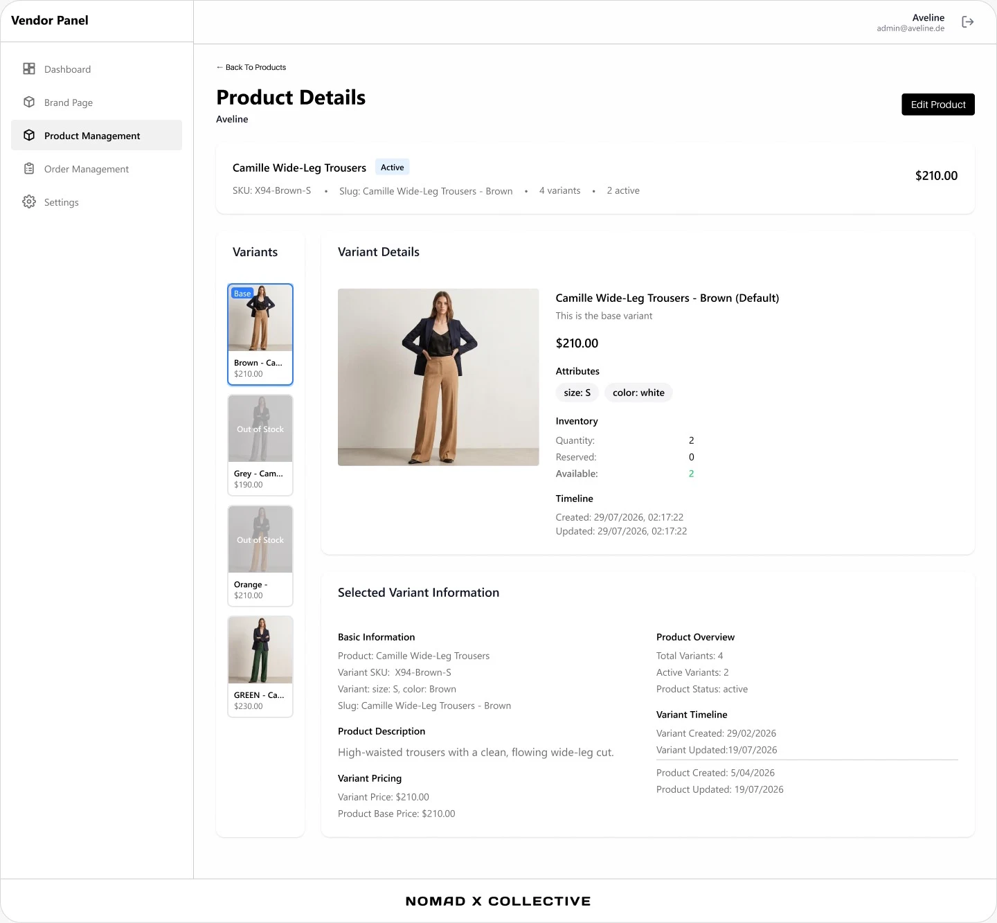
A product carries title, description and a base variant; what is sold is always a variant with its own SKU, its own attributes for size and colour and its own price. That is why a brand can price one colour higher than another and let individual variants run to “out of stock” while the product stays active.
Stock is not held as one number but as three: quantity, of that reserved, and available derived from those. This separation is the difference between a marketplace that sells the same last piece twice and one that does not.
2. Two decisions shape the design
- Onboarding is a state, not a form. Progress is saved per step, so a brand can interrupt the setup and continue it later. The price for that is that half-finished brands are allowed to exist: they have to appear in the system without appearing in the catalogue.
- The shipping step demands an input. The tracking link is the only piece of information in the order cycle that the platform does not have itself, and therefore the only point in it where the panel demands something before things move on.
For small, very deliberate manufacturers this decides whether growth is possible without running a logistics company on the side.
Write it yourself, have it proofread
A marketplace only stays curated if someone proofreads. At the same time, that proofreading must not mean that a brand writes an email for every image caption. We separated the two: the brand writes itself, but does not publish itself.
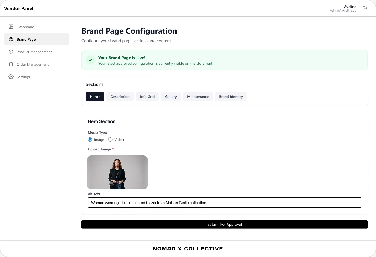
For that, the brand page is created in the panel as a configuration of six sections, each of them editable individually: hero, description, info grid, gallery, care and brand identity. The hero takes either an image or a video, and the alternative text sits next to it as a field of its own instead of as an afterthought, because otherwise it never comes about.
At the end there is no “save”, but Submit For Approval. Two versions therefore exist side by side: the one the brand is currently working on, and the last approved one, which the storefront serves. The panel says both in the same place, namely that the page is live and which version that is. Products run through the same mechanism, which is why the product list always shows an approval status next to title and variants.
The effect is that a typo on a brand page costs nothing and an unaligned appearance still does not go live. The price is a queue that someone has to work through, and precisely for that reason approval is limited to the brand page and the product catalogue and not extended to every stock change.
The order cycle, visible to both sides
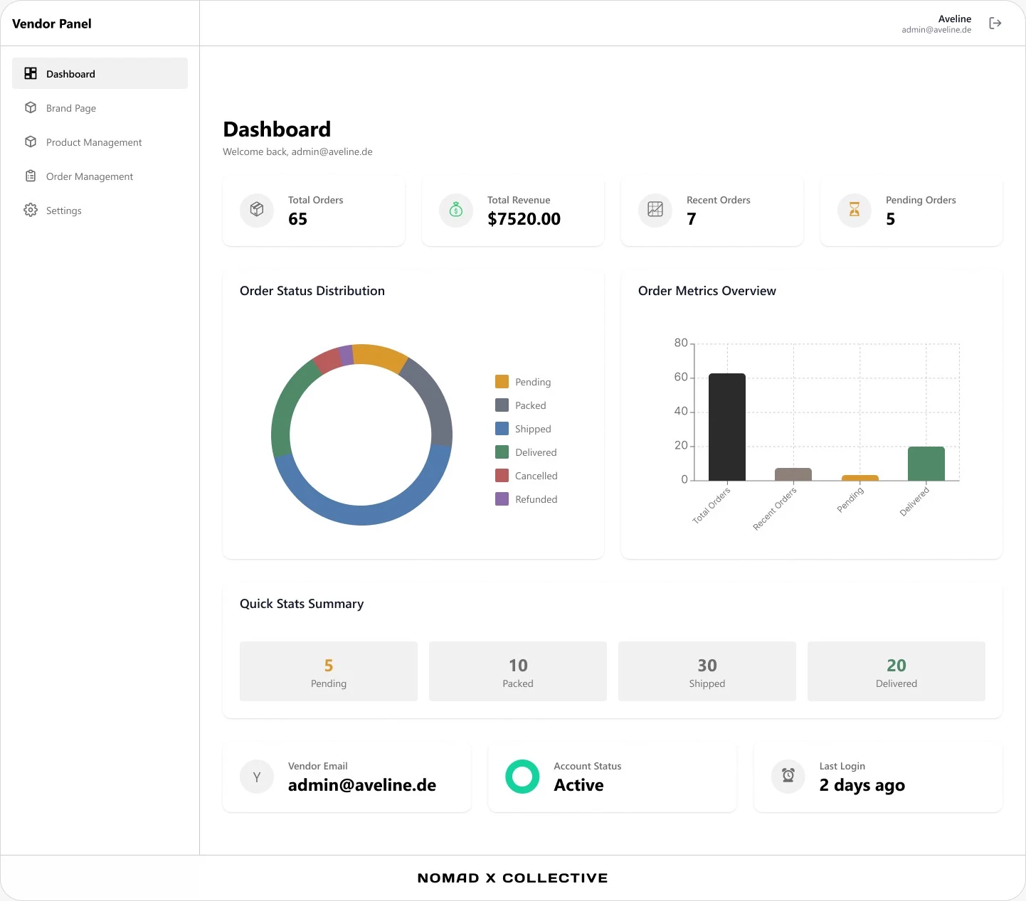
Both panels are built around the same metrics: orders, revenue, recent and open orders. We started with the dashboard, because the question about orders and revenue previously cost an export and a pivot table.
Underneath lies the actual subject, the order cycle. It knows six states, and the distribution across them is the first chart a brand sees after signing in:
- Pending, Packed, Shipped, Delivered as the normal path. “Packed” deliberately sits between receipt and dispatch, because with handmade goods days can lie between the two and a customer would otherwise not learn that anything is happening at all.
- Cancelled and Refunded as the two exits. They are not error cases but end states with their own consequences for stock and payout.
Alongside them stand the tasks that belong to the platform alone: user and merchant management with blocking and unblocking, order history and CSV export for accounting, the complete cycle including returns and refunds, and issuing the credentials for new partner brands.
Transactional emails run through Brevo, so that shipping confirmation, return and account creation take the same delivery path and stay traceable in case of doubt. On a marketplace whose shipments come from several directions, email is the only channel the platform controls completely.
Frequently asked questions
Nomad X Collective received a multi-vendor marketplace for curated fashion made of three connected systems: an admin area for platform operations, a vendor panel for partner brands and a storefront for customers. All three address one shared data foundation through the same REST interface. The storefront also carries a complete rebranding.
The Nomad X Collective marketplace is built on React with Vite and Node.js with Express. Images are stored in an AWS S3 bucket in the eu-central-1 region, transactional emails such as shipping confirmations run through Brevo, and Figma was used for design.
At Nomad X Collective, every partner brand ships through its own shipping account. The brand sets its part of the order to shipped and enters the tracking link, which is sent to the customer automatically by email. The brand confirms delivery manually. The basket shows shipping costs per merchant.
The Nomad X Collective vendor panel offers an import that connects an existing external shop, for example on Shopify or WordPress. The import saves retyping, but sizes, colour names and variants still have to be mapped to one shared vocabulary. How far the reconciliation reaches depends on the API of the platform in question.





Get to know more


HAVE A COMPLEX IDEA THAT YOU WOULD LIKE US TO IMPLEMENT?
KICK OFF WITH A DESIGN-THINKING PILOT OR A CONSULTING CALL.