

PROJECTSoftware & Automation
A Heavy-Industry Presence, Rebuilt from Zero
Website and A4 brochure for a heavy-industry engineering consultancy, rebuilt out of the firm's own reference list: counted figures instead of rounded ones, drawn schematics instead of stock photography, one printed document from the same content.
343
engagements, counted rather than rounded
37
A4 sheets from the same content
0
external font and CDN requests
Seventeen years of work, and none of it on show
The old site was a WordPress theme with a page builder on top. The headings sat in the default typeface, the title in the browser tab misspelled the company name, and under a section called Our Customer Stories there was nothing at all. No project, not a line. The navigation carried an item marked Projects, and clicking it landed you in the contact form.
All of it was illustrated with bought photography that would have fitted any company at all: people at laptops, meetings at bright tables. For a consultancy that sizes rotary kilns, writes the tender and stays on site until the line runs, that is not merely generic, it contradicts the subject.
And the figures meant to carry the whole thing were round: 12+ years, 50+ clients, 200+ projects, 14 countries. Round numbers are the weakest kind of evidence a reference page can offer, because nothing about them can be checked and they therefore cost nothing to write.
Built for Colleagues Consultants Private Limited.
The evidence already existed, just not online
The client has kept its own reference list since the year it was founded: every engagement, with client, place, discipline and fiscal year. It existed as a presentation file and had never been published. That turned the problem from making the site sound credible into the far smaller one of getting that file into a website without retyping it.
A script reads the file directly, with a small zip reader of its own written over the standard library and no third-party package, and writes out the collection the site builds from. The client roster and the country roster are then counted from that collection rather than maintained beside it. A new revision of the reference list is therefore one command and not an editorial project.
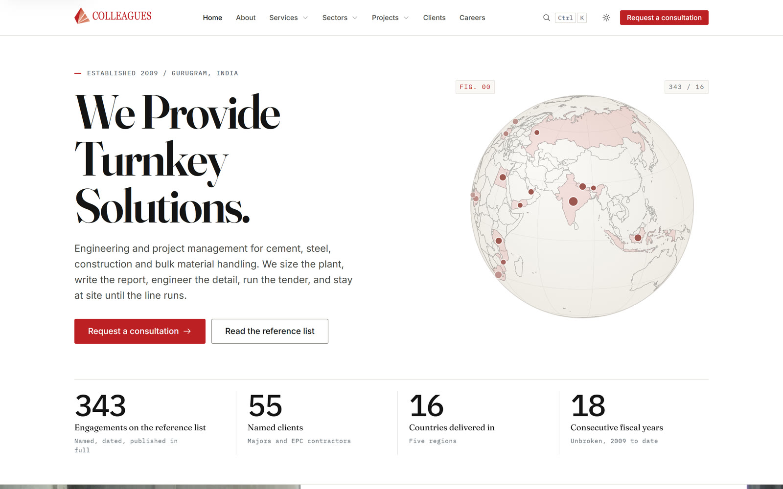
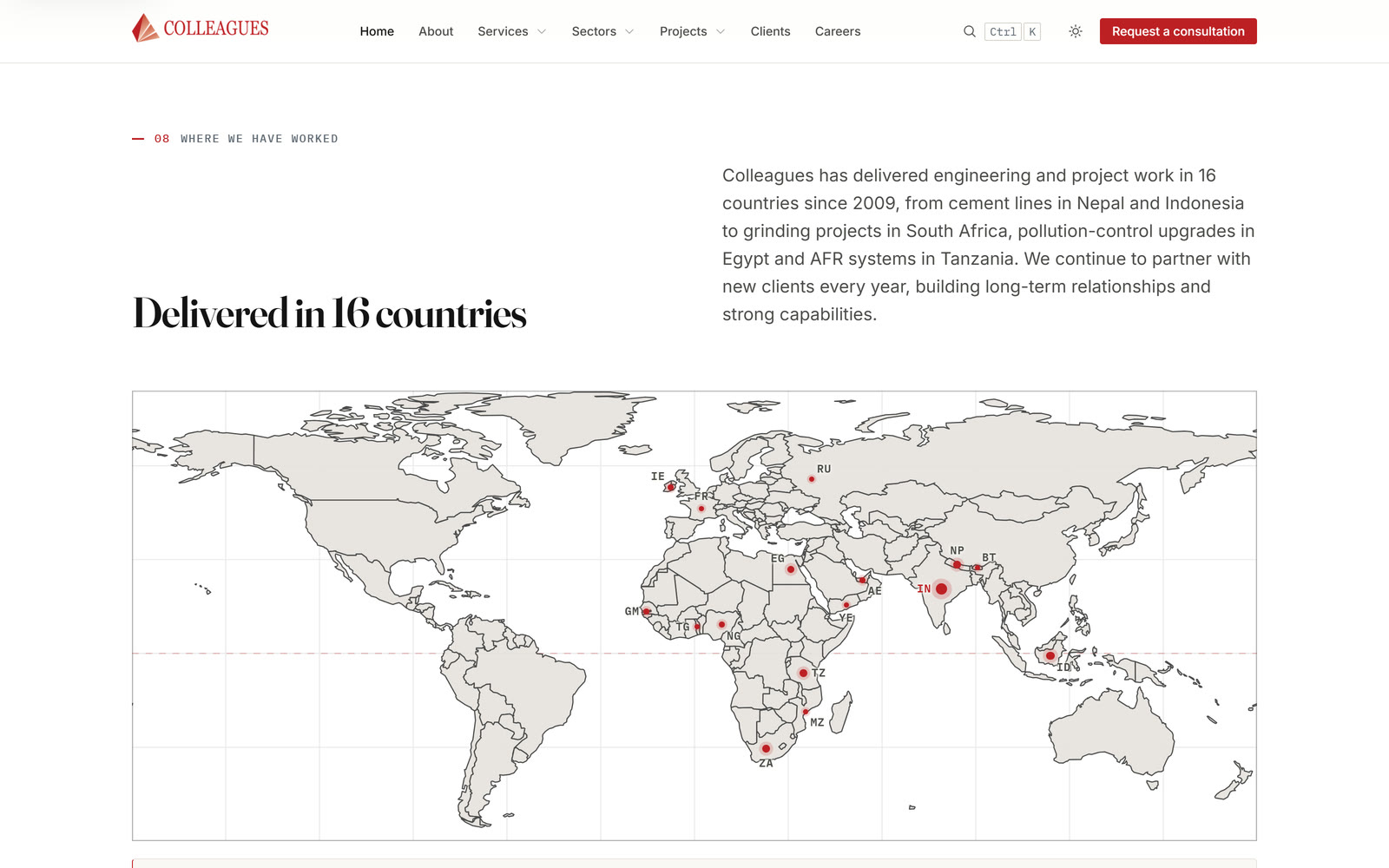
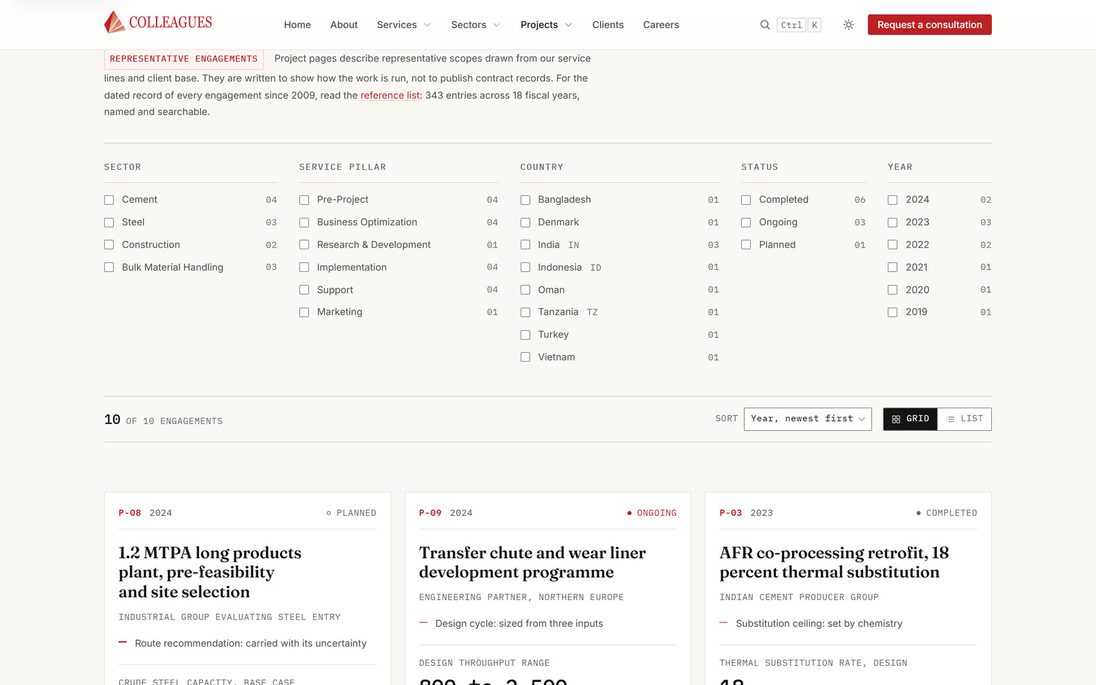
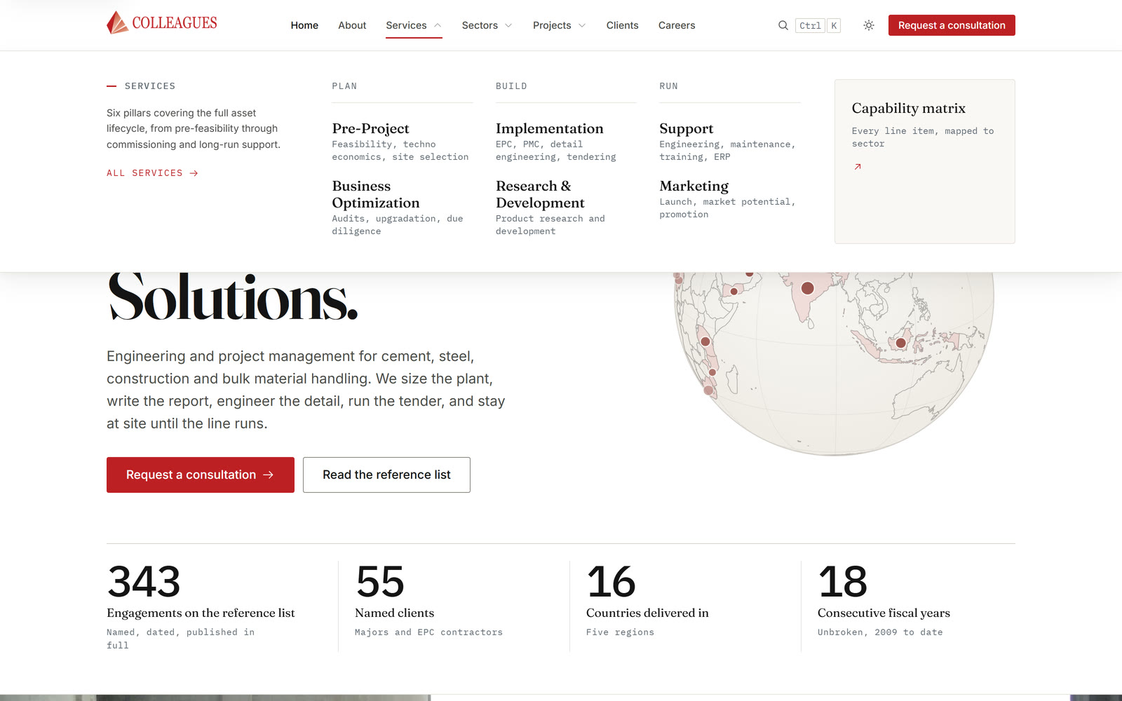
What stands on the site afterwards is counted: 343 engagements, 55 named clients, 16 countries, 18 unbroken fiscal years. The round numbers of the old site are gone and were not replaced.
There was a reason for that beyond tidiness. Reconciling the two showed that part of the old country roster could not be supported. The wrong entries had survived five review rounds, because a list that looks plausible gives nothing away to a proofreader. That is exactly why clients and countries are now derived rather than written: a figure computed from the register cannot disagree with it.
No picture that is not of the plant
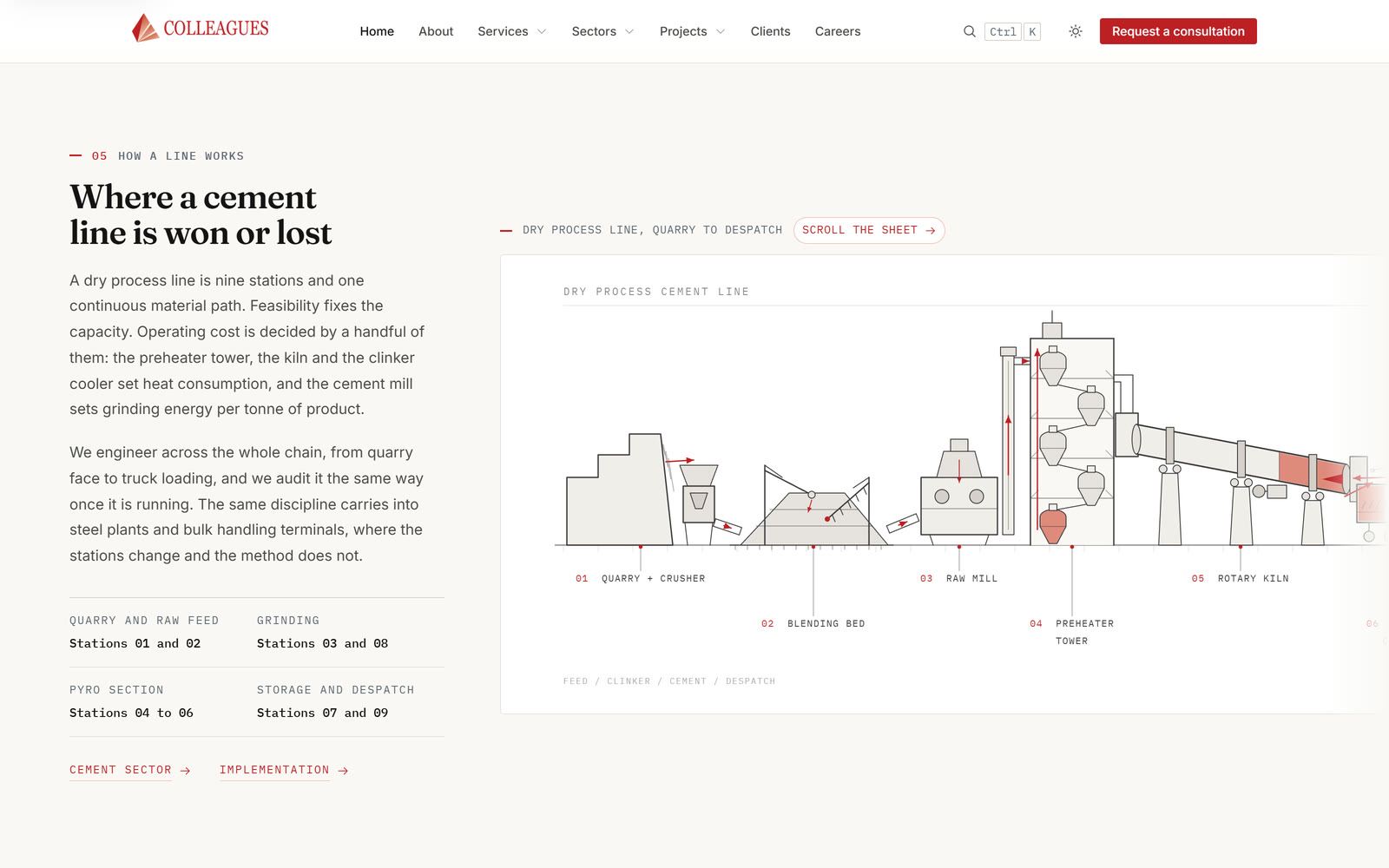
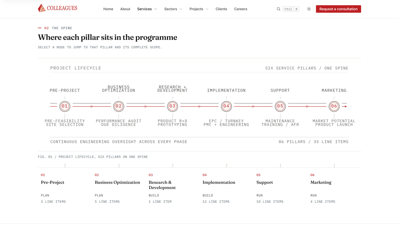
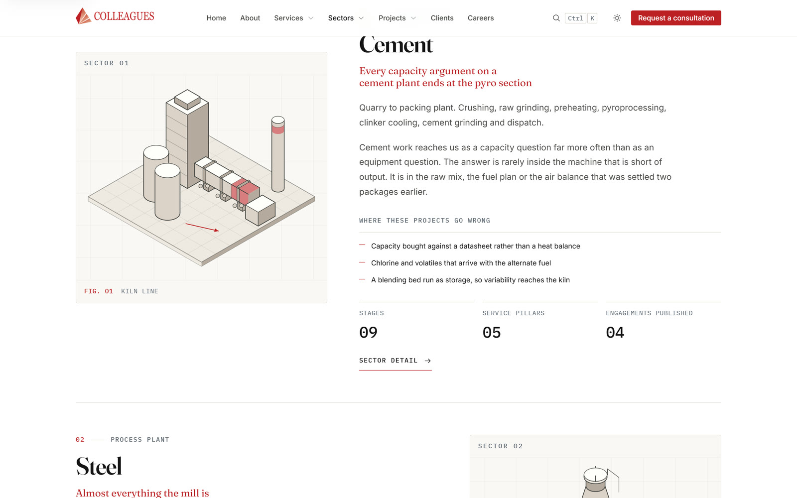
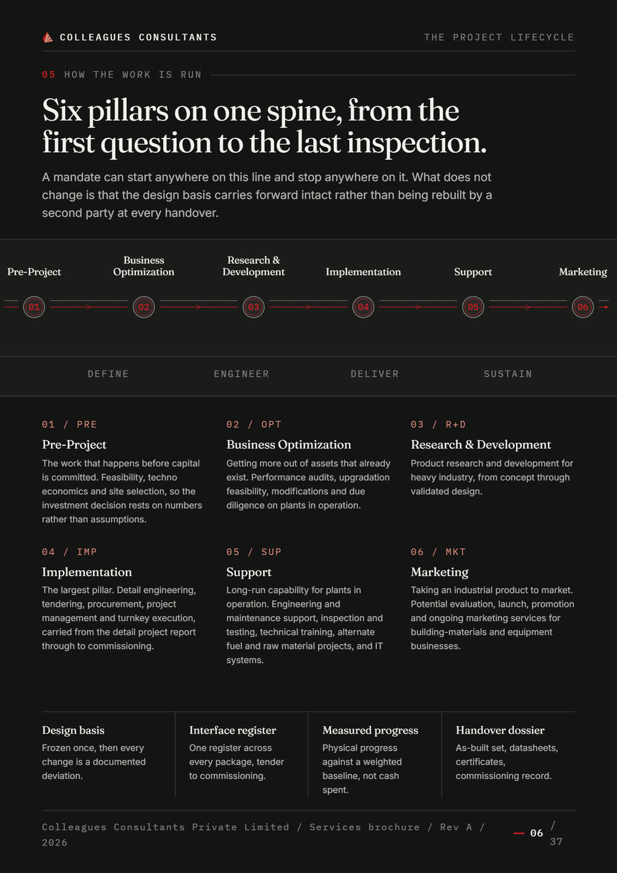
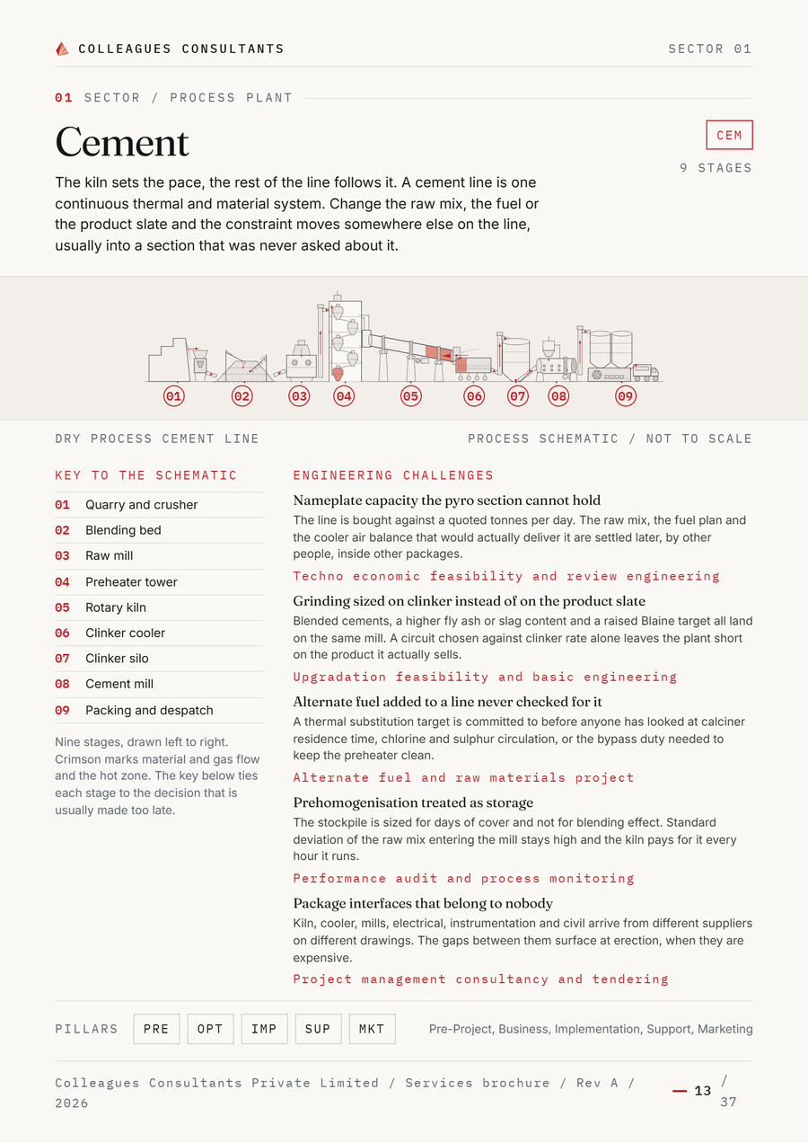
The stock photography was not replaced with better stock photography but with ten hand-drawn schematics: the cement line from quarry to dispatch, the bulk material flow, the steel route, the project lifecycle and four isometric sector plates. It is the visual language of a technical drawing rather than of a picture library, and every single one of them says something about the subject.
The rules behind them are kept narrow so the set reads as one hand: exactly two stroke weights, labels in the monospace layer with leader lines, and red only where it carries meaning, which is flow arrows, hot zones and active nodes. Colour is not painted into the drawing but comes from variables, which is why the same file is correct in the light and the dark scheme without existing twice.
Labels in a drawing are where a set like this falls apart: one slides over an edge, two overlap, and nobody notices, because nobody looks at all ten files side by side. So a check measures every label against its neighbours and against the frame on every build. That is 106 labels at present, all clear.
The world map is not drawn at all. It is computed from open boundary data: rings unpacked, reassembled across the antimeridian, simplified and flat-projected. The same script writes out, from the same constants, the conversion the markers are plotted with. Map and markers cannot drift apart, because both come from one source.
A globe that stops computing
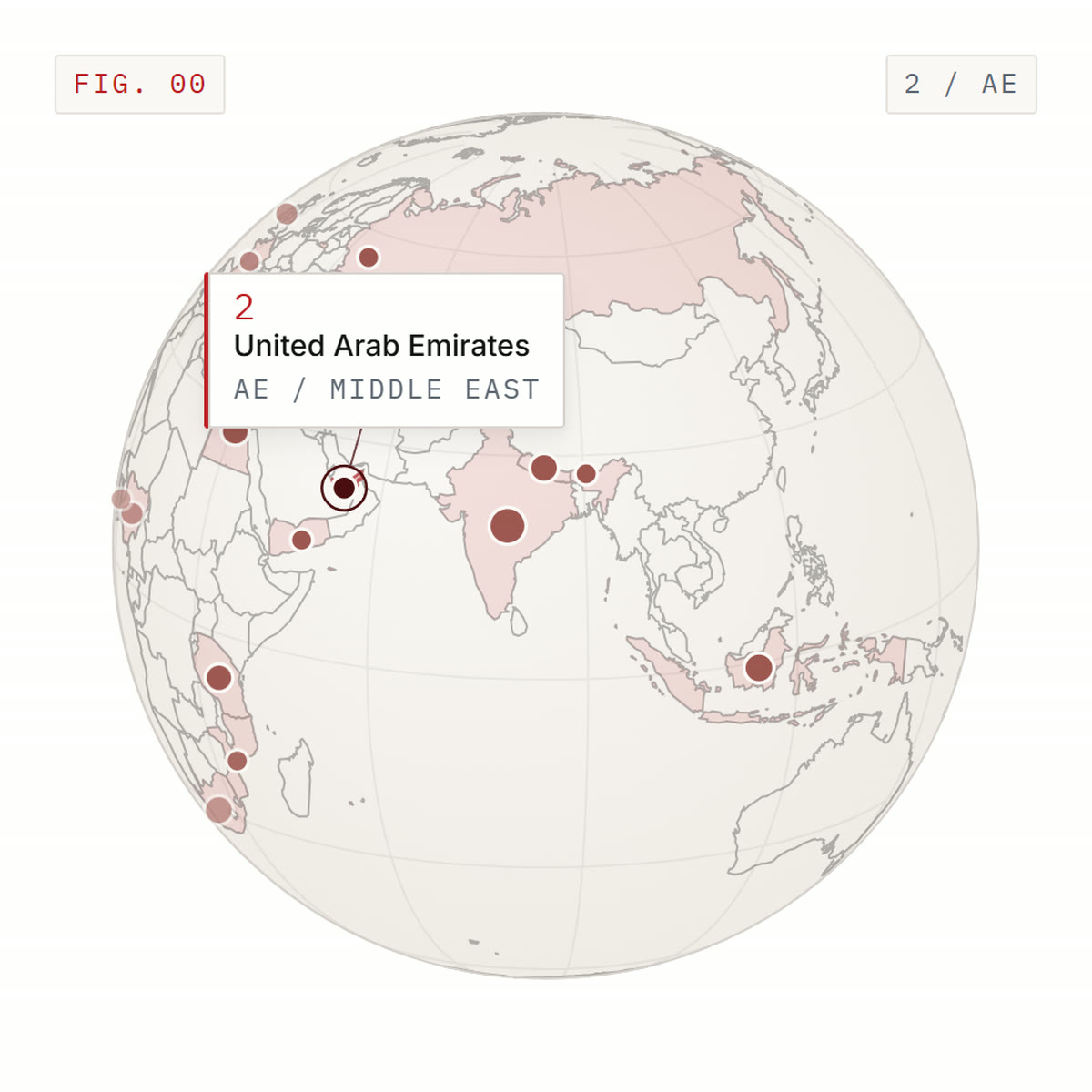
The home page carries no hero image but the register itself: a sphere with every country on it as a dot, weighted by how many engagements were delivered there. You turn it, pick a country out and read the number beside it. The evidence is not a sentence about the evidence, it is the control.
Underneath is a drawing engine, not a framework. The coastline is precomputed, delta encoded and sits at about 56 KB packed; it is fetched only after the first paint, which is why the built home page itself stays around 42 KB packed and the largest element on load is the headline, not the canvas. Beneath it, as the starting picture, lies a static drawing of the same sphere, so nothing blinks and nothing jumps before the data arrives.
The loop stops as soon as it has nothing to do. If nothing is being turned, nothing is selected, the sphere has scrolled out of view or the tab is in the background, it does not keep running: it halts and restarts on the next event. A home page that draws sixty frames a second into an unwatched window for hours is a defect you notice only at the fan.
The same engine serves two consumers, the home page and a standalone demo file, and a check insists it remains one file with one export. Otherwise the second sphere would have appeared before long, quietly disagreeing with the first.
Two schemes, two attributes
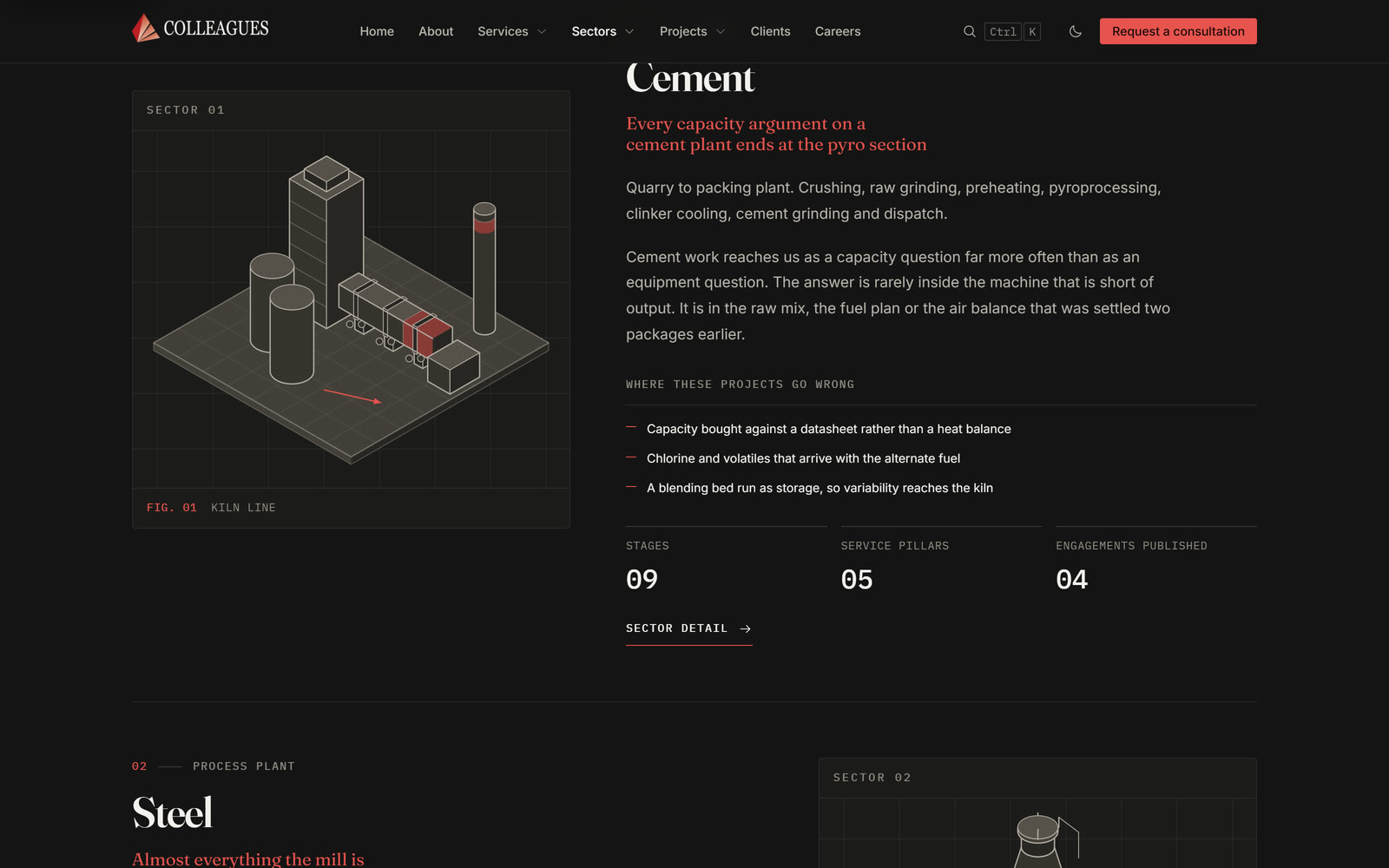
Light is the default and dark is a decision. The site deliberately does not follow the system setting while the visitor has chosen nothing: an engineering consultancy is read on paper white first, and anyone who wants it otherwise says so once.
Two separate attributes carry that. One holds the choice, the other the scheme derived from it, and every component asks only about the scheme. It sounds like one attribute too many, and it is the reason a third colour scheme would be an addition in one place here rather than a change across eighteen components. Both are set by the same script before the first paint. Write them separately and you get a page that paints dark type on dark ground for one frame.
One surface behaves unlike all the others, the inverted one: its ground flips with the scheme, so the legibility of the accent on it flips too. It therefore carries an accent value of its own, taken per scheme from the appropriate end of the red ramp. Without it the company red would sit at a little over 2:1 there and be invisible on a laptop on a train.
Measured, not estimated: the contrast table for the light scheme is computed, all 28 pairs checked meet AA, and the weakest sits at 4.90:1.
One page width, and a fault no screenshot shows
For a while the site ran two widths, a narrow one for the header and the heroes and a wide one for photo bands. That puts two vertical edges on the same page, and once you have seen it you see it everywhere. There is exactly one page width now, header included.
The gutter is tied to that width rather than chosen: its ceiling is the rate at which it grows, times the maximum width. Set the one number freely and you build yourself a fault that looks like nothing. The gutter sits inside the maximum width. If it keeps growing after the width has already been capped, then the content gets narrower as the window gets wider. That is exactly what happened here once, with a peak just short of the cap and a drop beyond it.
A screenshot never shows that, because every single frame is plausible on its own. A check shows it immediately: it measures content width per route and per viewport, prints it as a row, and a dip anywhere along the row is the proof. The same run walks every element at three phone widths and names anything that reaches past the document edge.
Two findings from it are general enough to take away. A centred grid item is sized to its maximum content, so a long caption blows the grid out until you cap it explicitly. And overflow does not apply to a table box, which is why the helper class that hides content for screen readers does not clip a bare table but leaves it standing.
The same content, printed
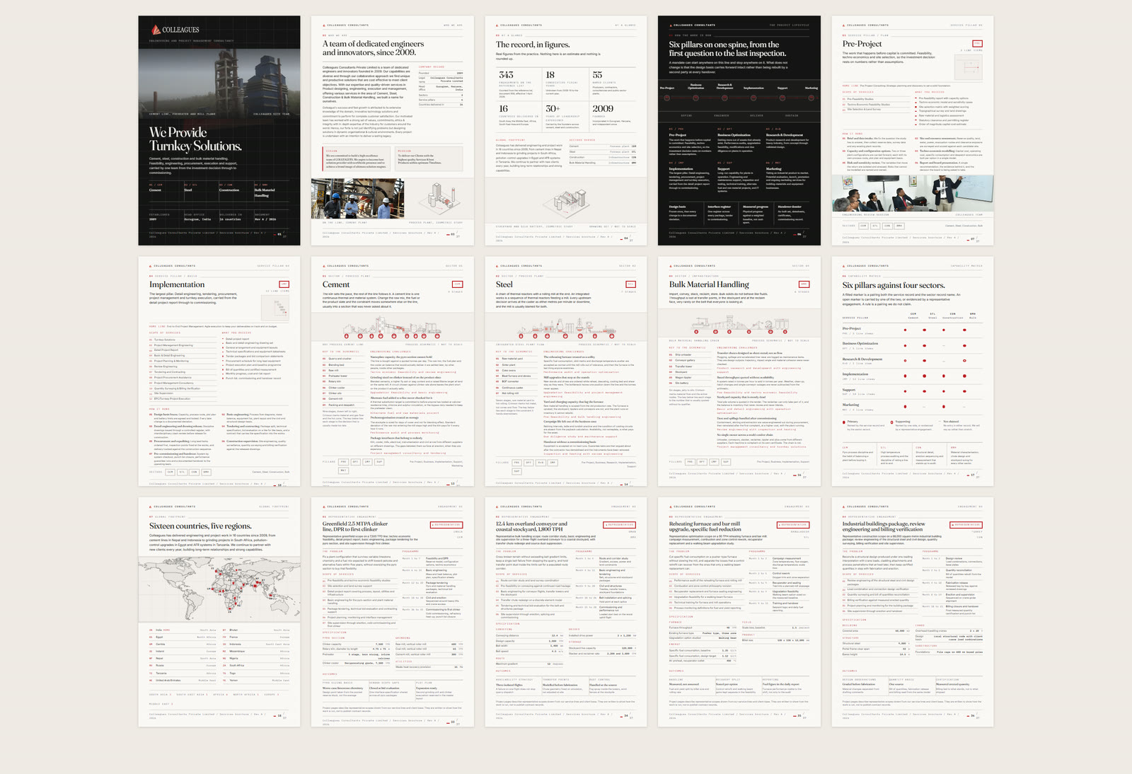
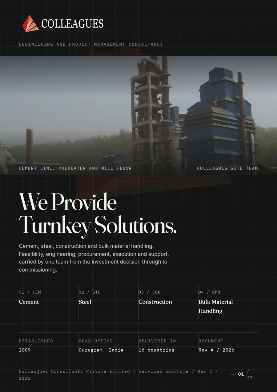
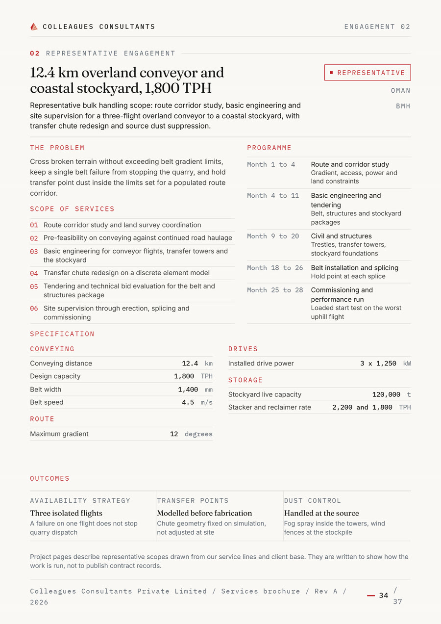
Beside the website stands a brochure of 37 A4 sheets, and it is not a copy. It is a single HTML file with its fonts and pictures embedded, read in the browser and printed out of it. What appears on it comes from the website's content files. Change one line of service copy and both editions change.
The pagination is computed, not typeset. The build step costs every row in printed units and fills sheets until they are full. The constants that takes are not estimated but measured: a check renders the finished document and reads the boxes back. The first attempt guessed them, and twelve consecutive sheets overflowed.
Which is why there is a gate at the end that has to pass. An overflowing A4 sheet looks unremarkable on screen and loses its bottom edge in print without any message appearing anywhere. A fault that only becomes visible on paper is too late on paper. Beside it sits an export to an editable document, checked against the typesetting of the original, with a remaining deviation of two hundredths of a pixel.
None of this forces the two to stay in step on its own. The content is copied into the brochure deliberately rather than fetched at run time, so that a change to the website does not retroactively alter a document that has already been printed.
Editing stays in the house
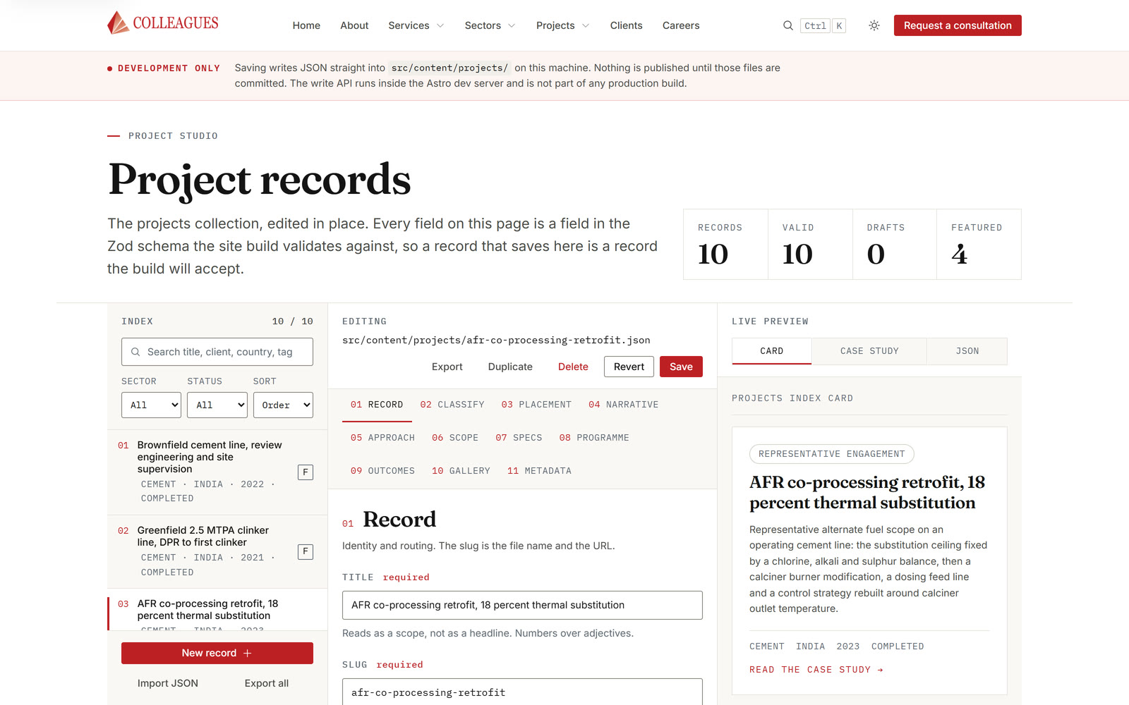
The project write-ups are the one part of the site meant to keep growing, and the only part that needs an interface. It exists, it sits at an address of its own and runs only on the editor's own machine: a list of the existing records, a form for every field, and a preview of the card and of the finished page beside it.
What it edits are the same files the site builds from, with no database and no account. Every field validates on save against the same schema the build validates against. A record that passes here does not break the build: that is the entire point of the exercise, and the flow is walked through in over thirty checks.
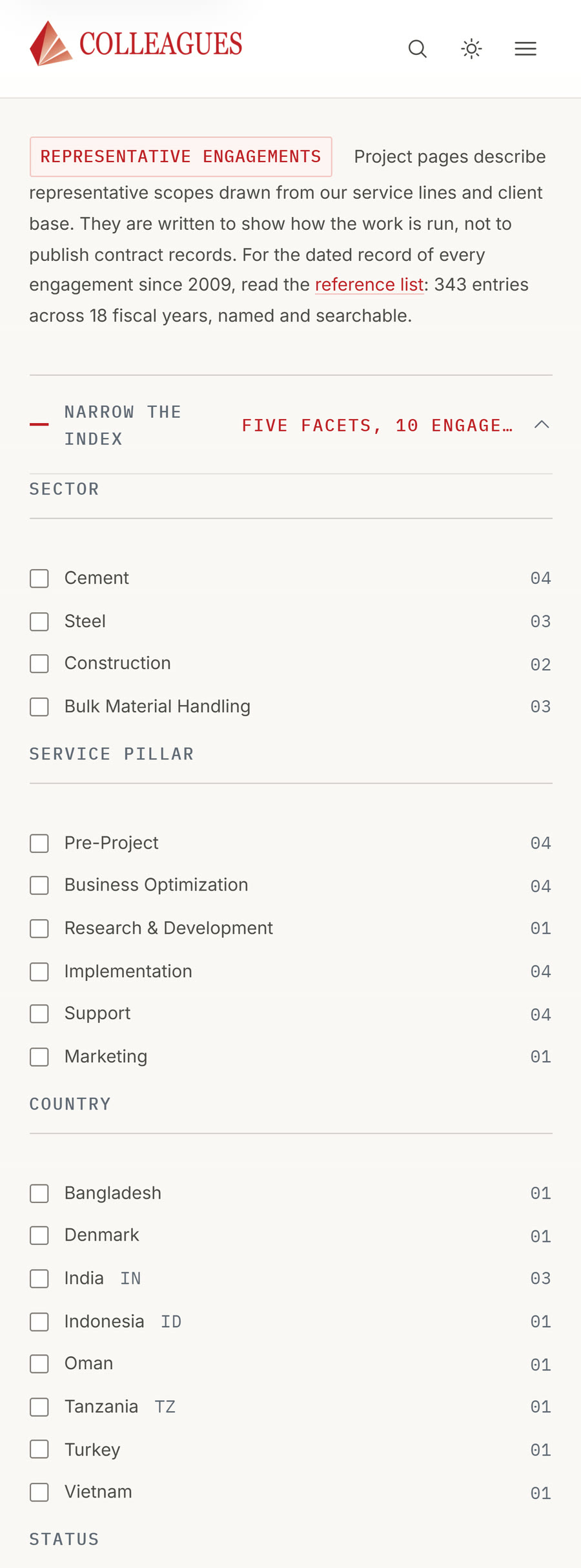
Where a write-up has no signed document behind it, it is marked as representative, visibly on the index and on every single entry. What is documented sits in the register; what stands beside it does not present itself as a contract file. That separation is the condition under which the one half of the site is worth anything at all.
Delivery is static out of a container: built files behind a lean server, a push on the main branch rebuilds. A footer names us as the author, in the quietest type on the site.


Frequently asked questions
For a heavy-industry engineering consultancy in India, the website and A4 brochure were rebuilt from the firm's own reference list. Counted figures replace rounded ones, ten drawn schematics replace stock photography, and the 37-sheet A4 brochure is produced from the same content as the website.
The engineering consultancy's website is built on Astro 5, TypeScript, Canvas 2D, SVG, Zod and Playwright. The site makes no external font or CDN requests and is served statically from a container. A push to the main branch rebuilds the site.
The figures on the rebuilt industrial web presence are computed from the reference list the firm has kept since its founding. A script reads the presentation file directly. The site therefore shows 343 engagements, 55 named clients, 16 countries and 18 unbroken fiscal years, with no retyping and no separately maintained lists.
The project write-ups of the industrial web presence have an editing interface that runs only on the editor's own machine: a list of records, a form for every field and a preview. It edits the same files the site builds from, with no database and no account, and validates on save against the same schema as the build.






Get to know more


HAVE A COMPLEX IDEA THAT YOU WOULD LIKE US TO IMPLEMENT?
KICK OFF WITH A DESIGN-THINKING PILOT OR A CONSULTING CALL.